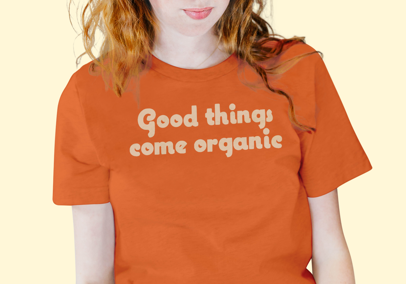
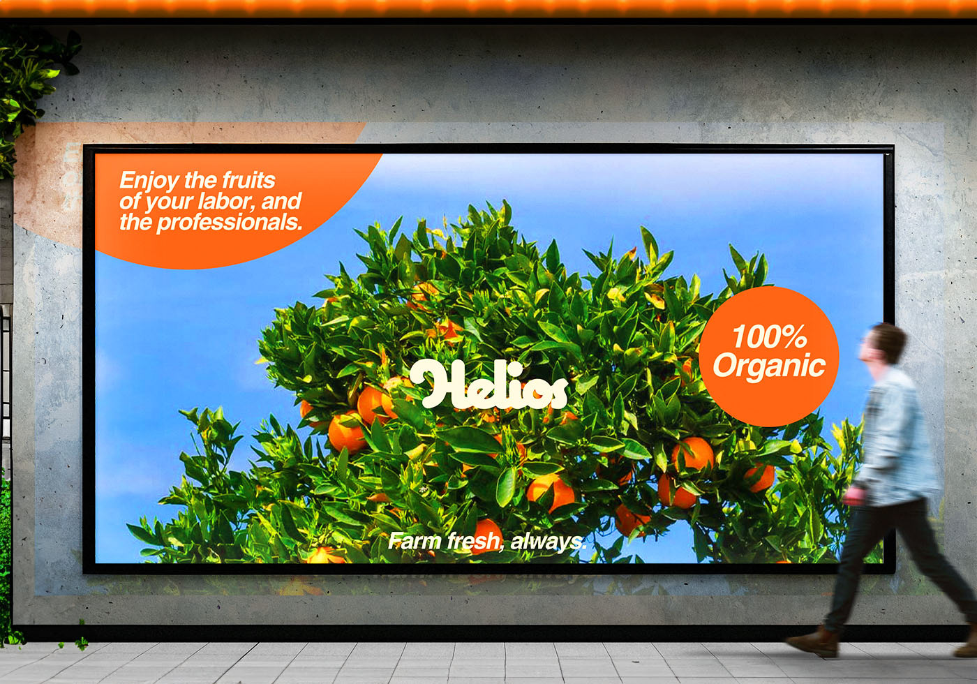
HELIOS is a concept agricultural and farming enterprise that provides fresh, locally sourced ingredients right to your door along with innovative investments in sustainable farming practices. In addition to being a farm research and development company, HELIOS also sells its primary product, an app. This app features an easy-to-use interface that enables users to order fresh local products and have them delivered right to their house. They provide a home package where customers can purchase fresh ingredients from chef-prepared recipes and a restaurant service package where small and larger companies may team up and receive regular deliveries of fresh ingredients.

Main animated logo created using Adobe After Effects
COQUETTE: WHY?
The choice of the "Coquette" font for the HELIOS logo and brand identity was deliberate. Its playful and whimsical nature brings a sense of fun and freshness, aligning perfectly with the brand's focus on fresh food and ingredients. The exaggerated curves evoke an organic feel, mirroring the natural shapes found in produce. Overall, "Coquette" captures the essence of Helios—a delightful blend of creativity and nourishment.

CUSTOM TYPEFACE: WHY?
To create the custom typeface, I meticulously softened and transformed the original Coquette font. By drawing back the arms of each letter and gently rounding out their edges, I achieved a more organic and approachable feel. These subtle adjustments not only softened the overall appearance but also harmonized with Helios's brand identity—a celebration of fresh, wholesome ingredients. The result? A bespoke typeface that embodies both playfulness and natural elegance.

COLOR PALETTE: WHY?
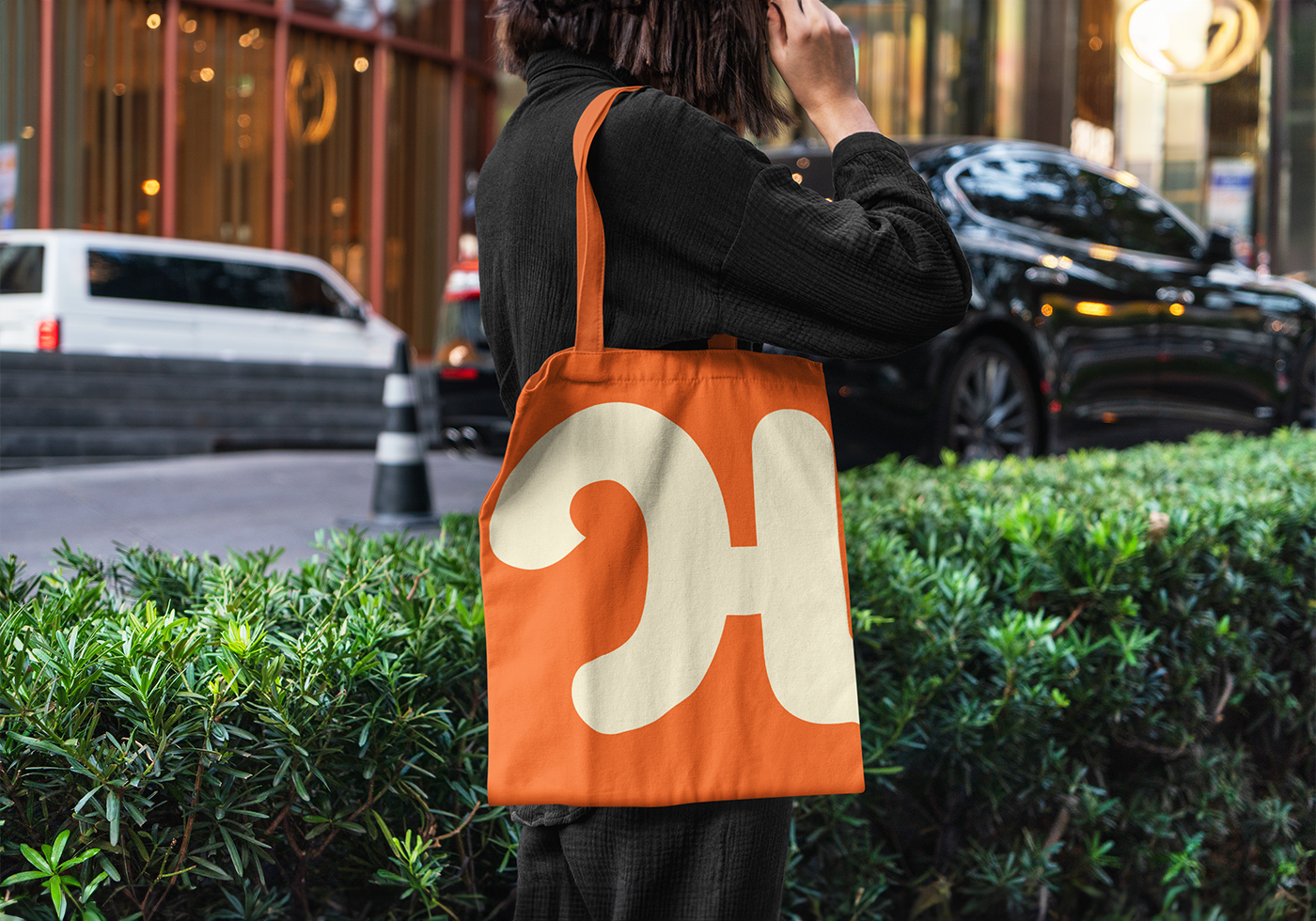
The HELIOS brand identity color palette was thoughtfully curated to evoke specific emotions and associations related to fresh food. Oranges: The vibrant orange hue symbolizes energy, warmth, and vitality. It mirrors the sun-ripened fruits and vegetables that HELIOS celebrates. Orange stimulates appetite and conveys a sense of freshness. Green: Green is synonymous with nature, health, and growth. It represents the lushness of fields, the crispness of lettuce leaves, and the promise of nourishment. Green also fosters feelings of balance and well-being. Blue: Pale blue, reminiscent of clear skies, aligns with purity and cleanliness. It suggests freshness and a commitment to quality. Blue also evokes trust, which is crucial for a brand centered around food. Pale Yellow: This soft, buttery yellow exudes warmth and friendliness. It's akin to sunlight filtering through leaves, illuminating the bounty of nature. Yellow uplifts moods and adds a cheerful touch. Together, these colors create a harmonious palette that resonates with the HELIOS mission: to provide wholesome, farm-fresh delights.
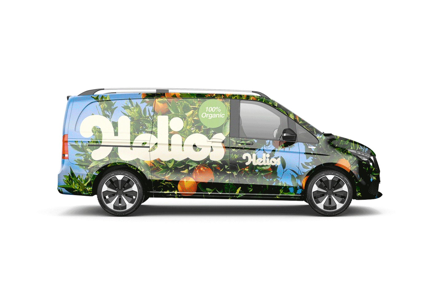
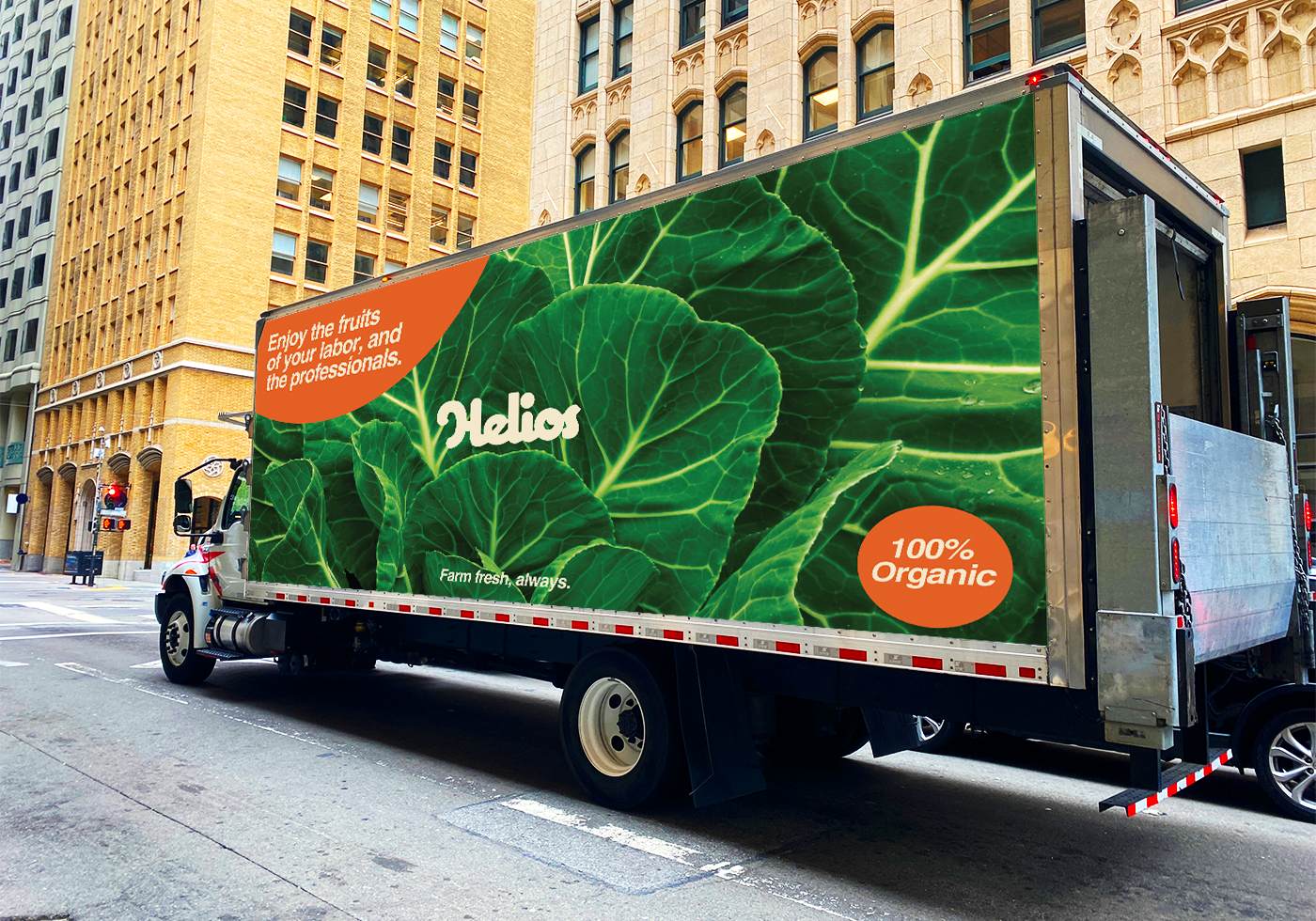
HELIOS transport designs are fun, fresh, and vibrant!
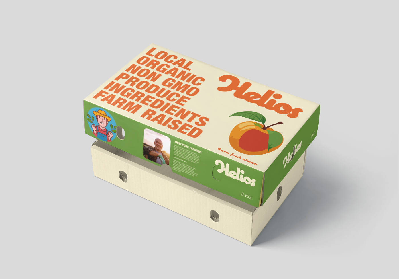
HELIOS 5KG fruit box packaging
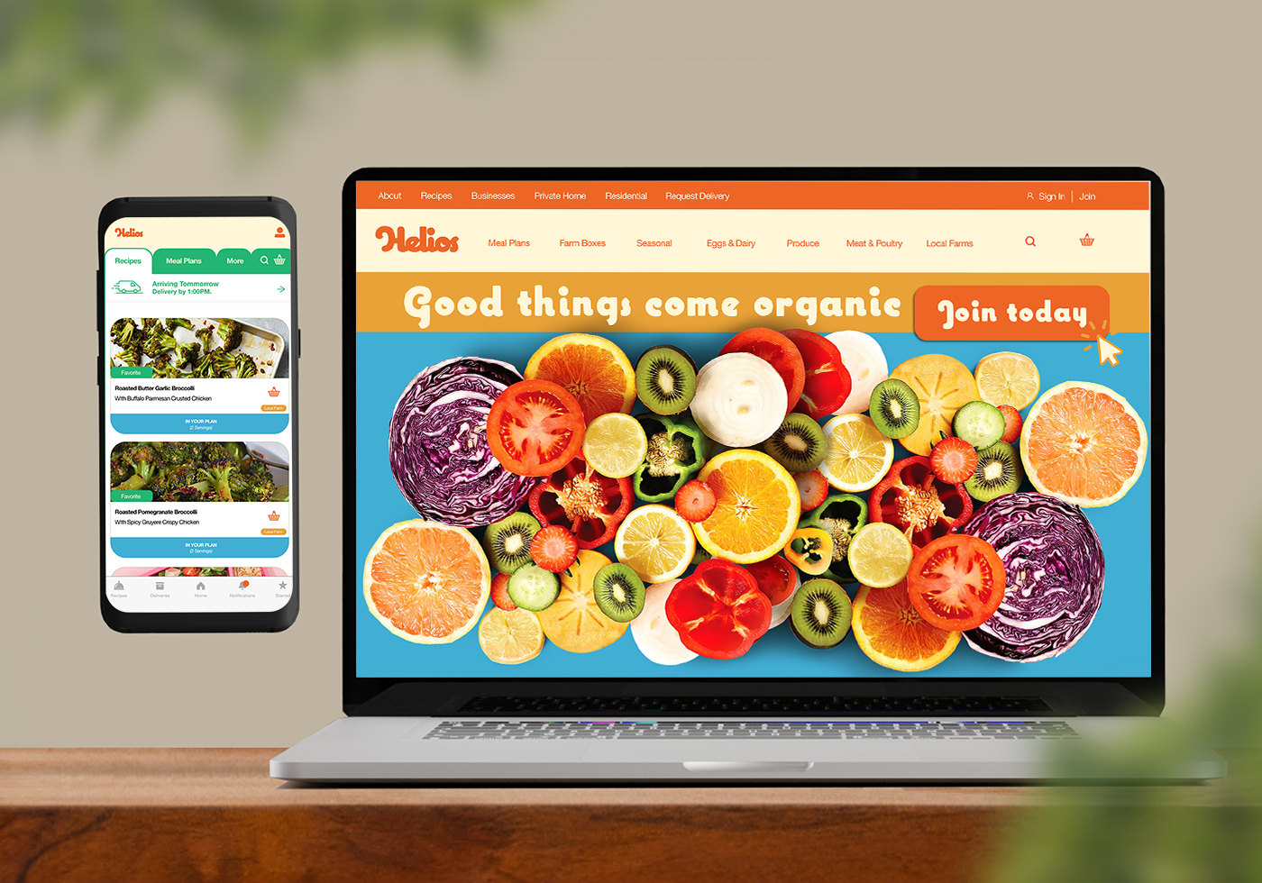
UI/UX design & Web design
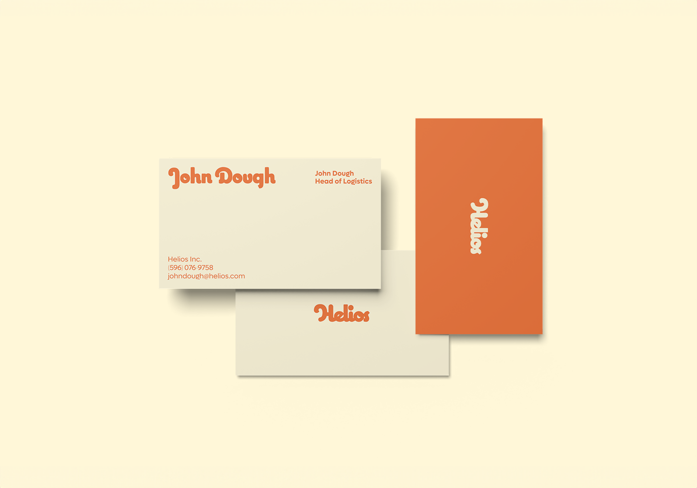
HELIOS Corporate stationery