MY STORY: WHY?
The catalyst for my interest in design sparked around the age of 11-12. As a child I became interested in Graffiti, and how it decorated the city landscape. I enjoyed the idea of anonymous creatives and groups of people placing art around the city, to promote themselves or others. Could be for a band, crew, website, product or service. I started off with designing, creating and printing stickers. This passion evolved into a career path and has made me the person I am today. I continue to explore and experiment with various design disciplines, and work with a wide variety of clients who currently find me through social media and referrals.
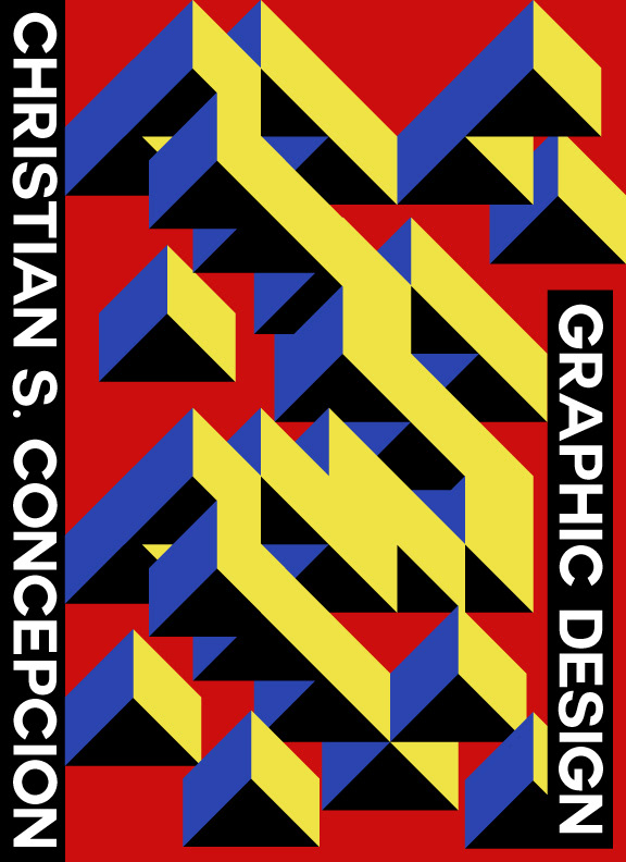
ARCHIVE: WHY?
This page is merely meant to give you a better understanding of who I am. A selection of my experimental design work that I have produced in my free time is shown here. I hope it demonstrates my own aesthetic preferences, design interests, and range of technical know-how required to put things together. More info on each piece in the captions.
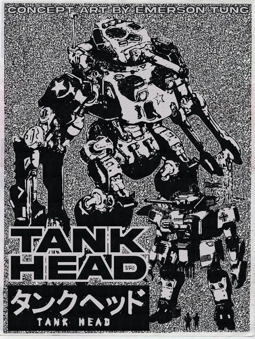
A Poster Design I created for "TANK HEAD Concept Art by Emerson Tung"
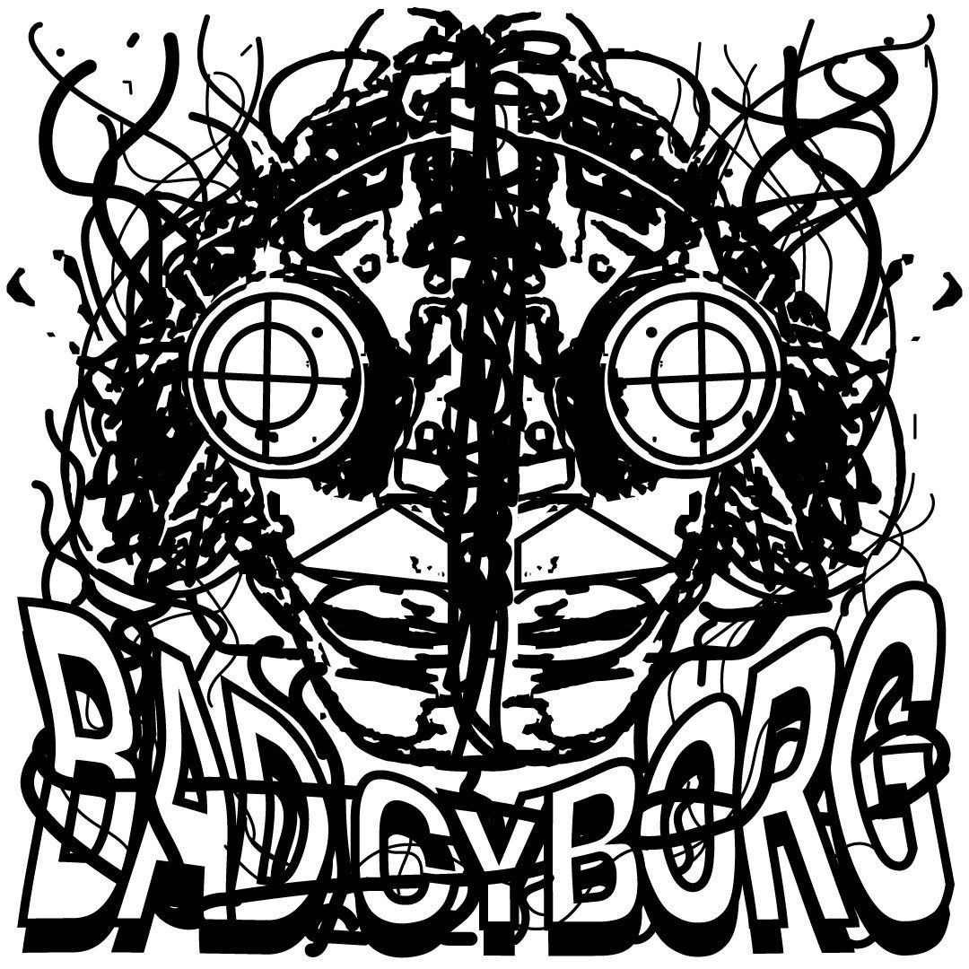
A chaotic punk-y style design I created for a concept company called "BAD CYBORG"
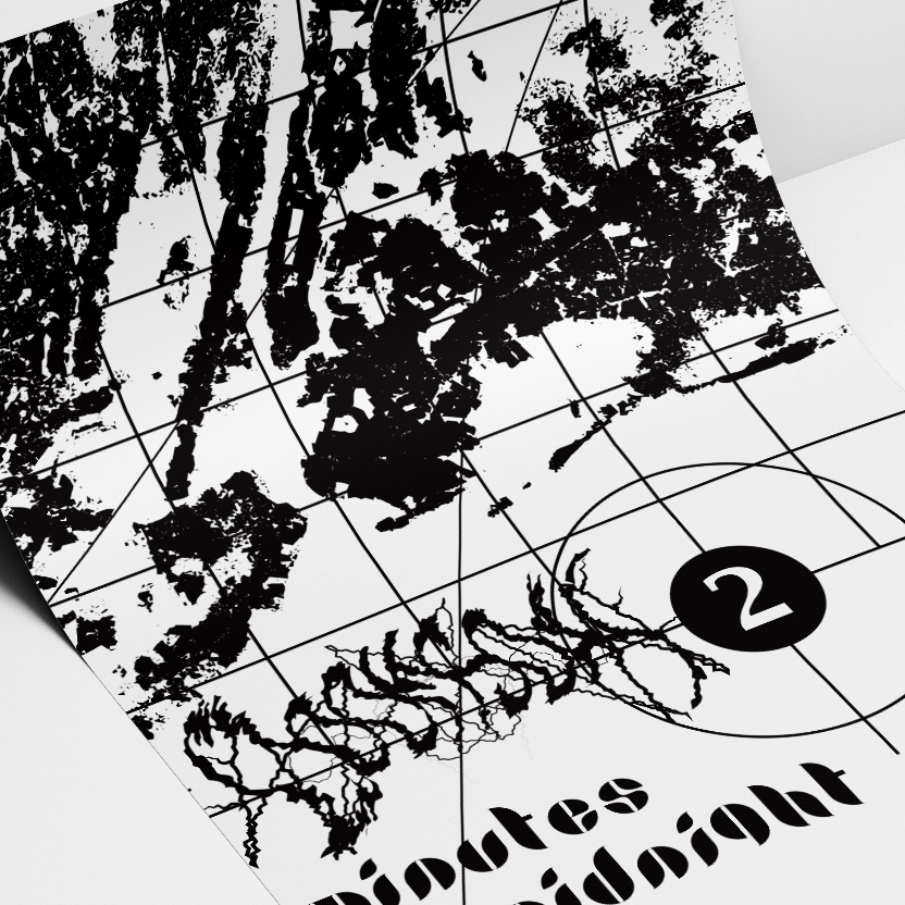
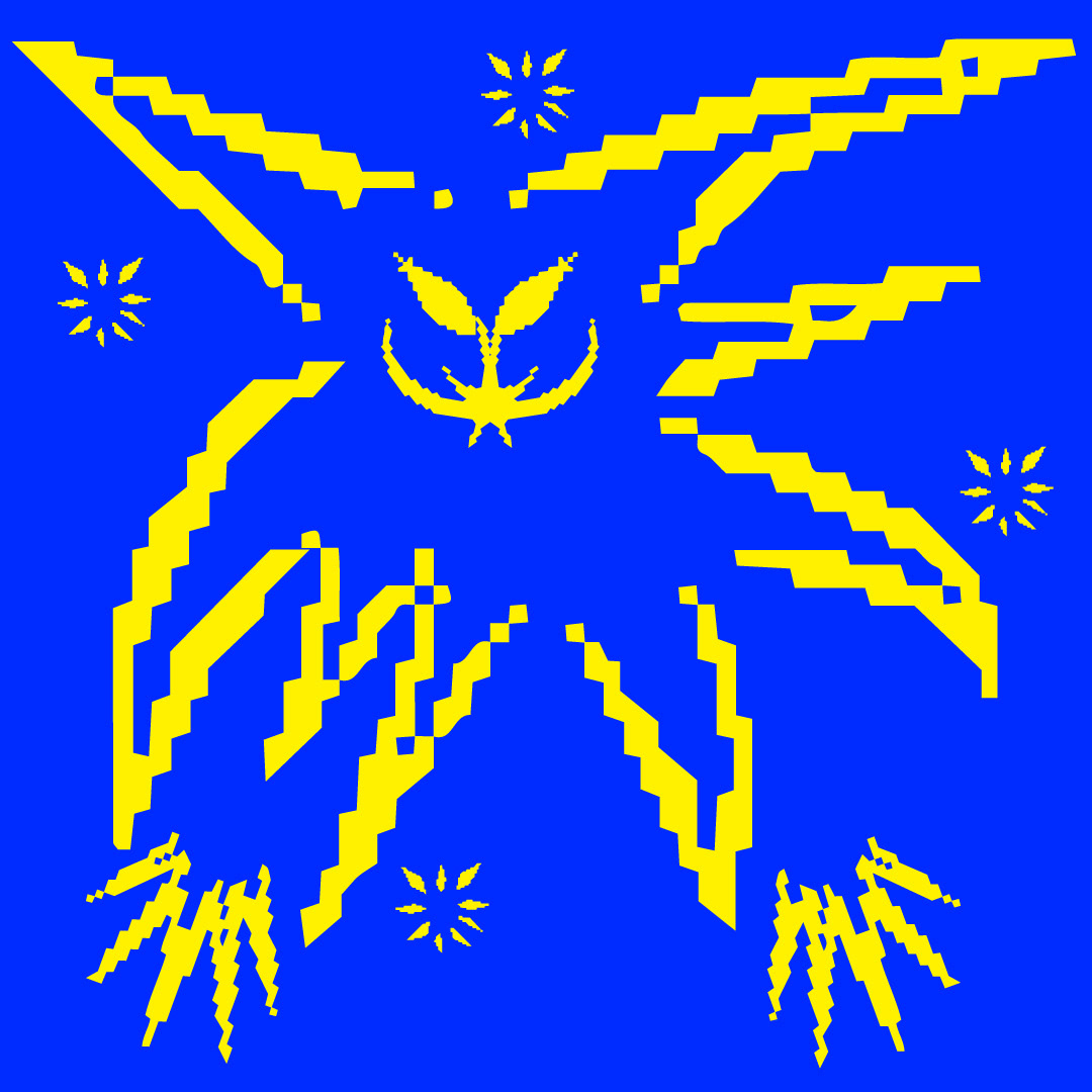
An exploration in poster mockups. A flyer print design the theme being "2 minutes to midnight"
An exploration in 8-bit character design. This design titled "Evil Sprite"
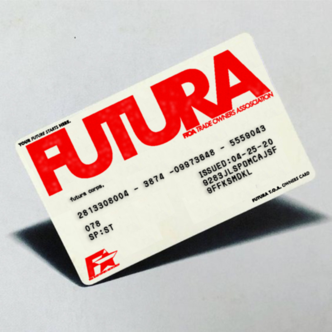
An exploration in designing and creating corporate assets and mockups. This being an owners card for a concept corporate identity called "FUTURA"
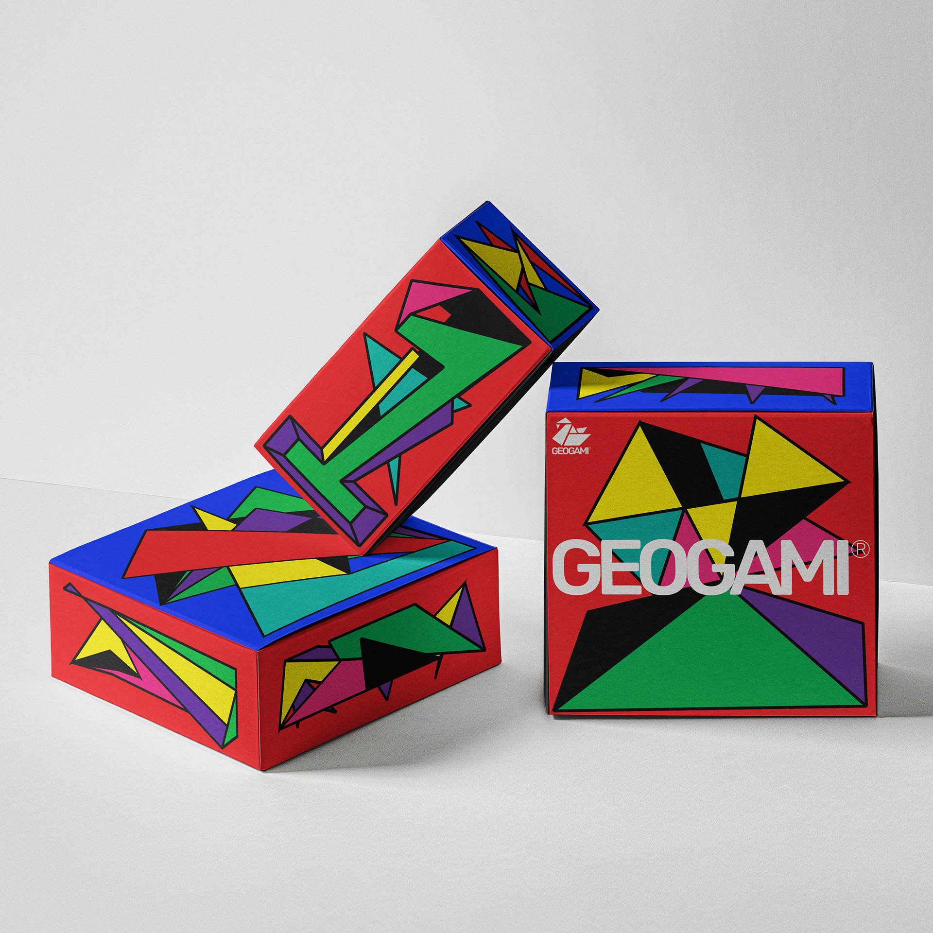
An exploration in packaging design and using mockups. This being for a concept game/toy I created called "GEOGAMI"
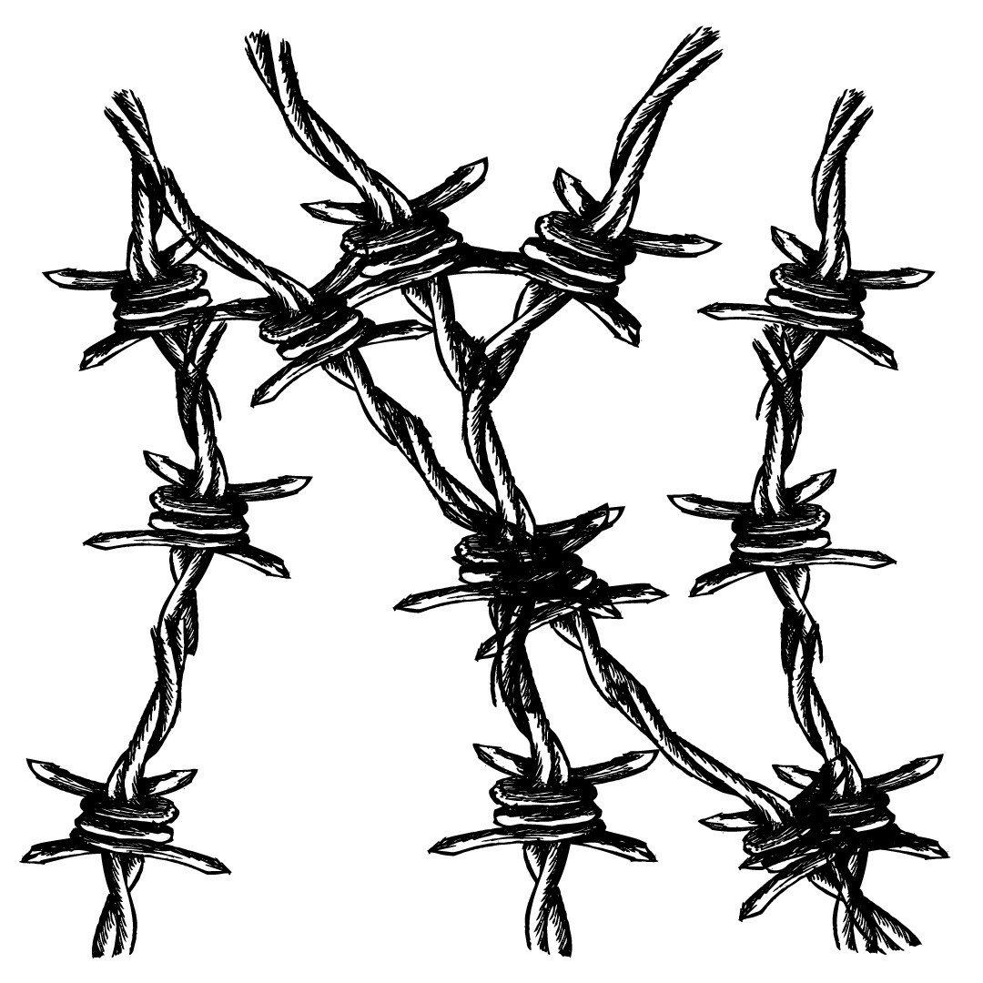
This was a design I created for a tattoo on my arm. The New York Yankees logo made of barbed wire.
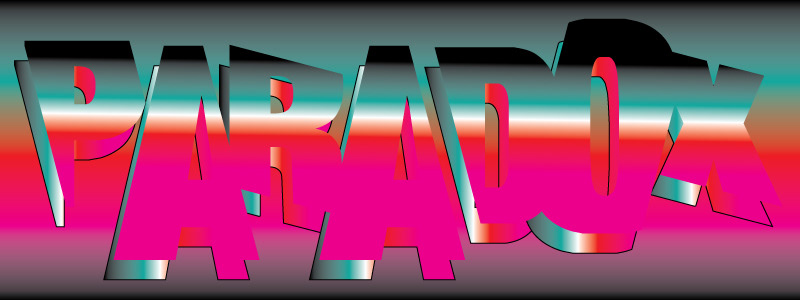
A banner sticker for a concept company called "PARADOX"
Cover design for my first portfolio book.
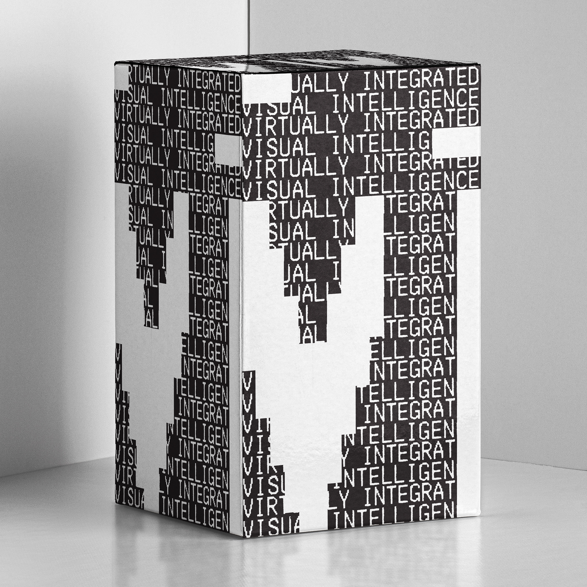
An exploration in packaging design for a concept tech company "ViVi" an acronym for "Visually Integrated Virtual Intelligence" could be a console, or computer in there.
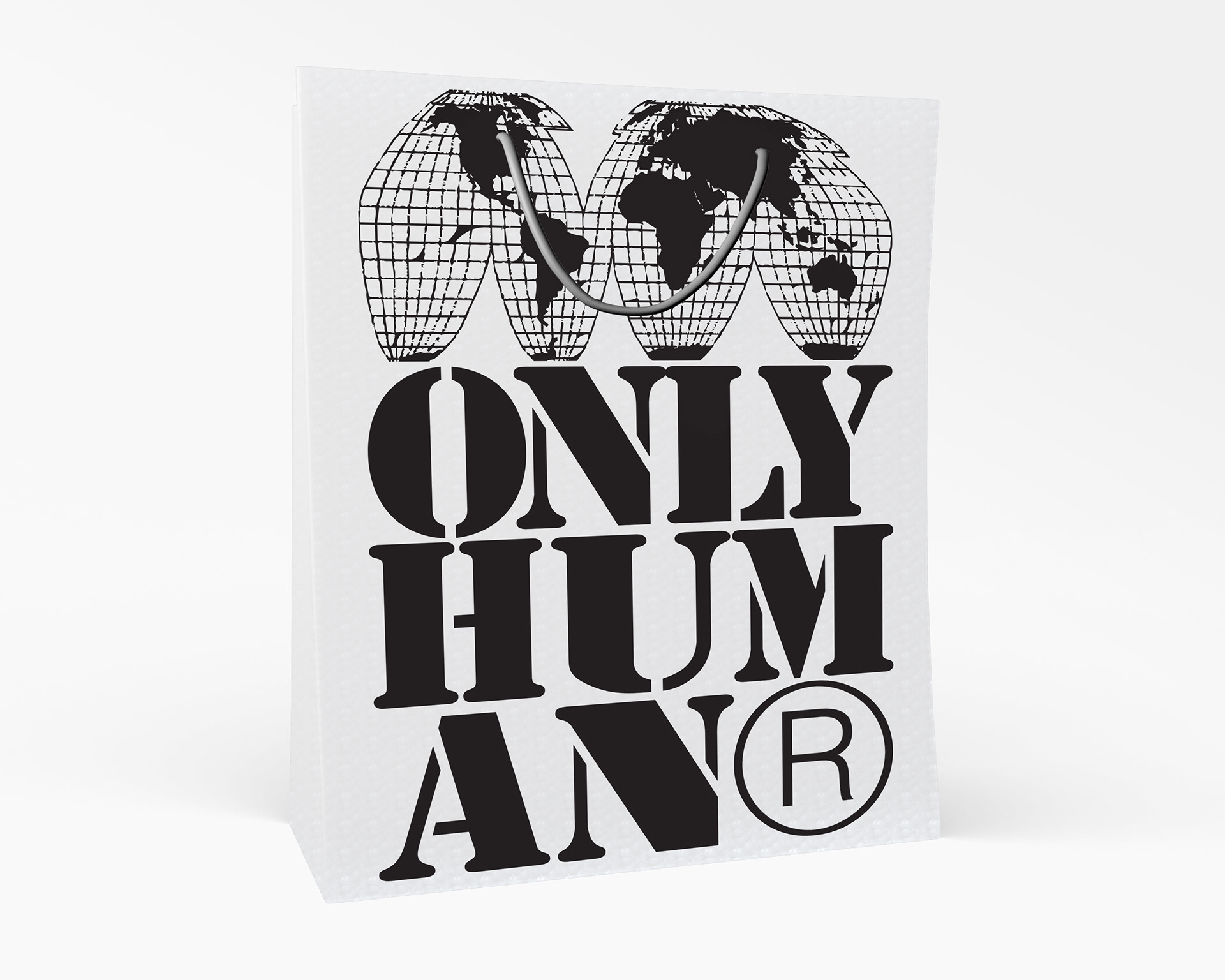
A bag design I created for concept retail brand I created called "ONLY HUMAN"
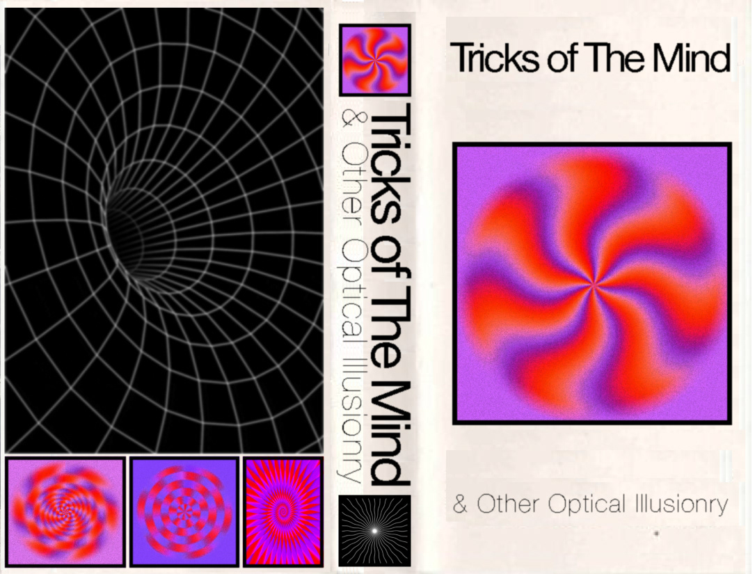
Here is a book cover design complete with front back and spine for a concept novel about optical illusions titled "Tricks of The Mind & Other Optical Illusionary" Those still images do really look like they're moving (Its not a GIF).
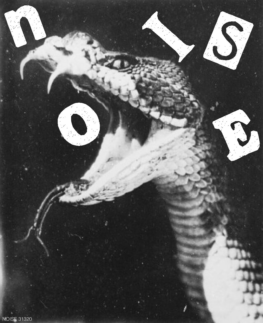
A sticker graphic I created for a concept music/lifestyle magazine/collective I created (and very softly/subtly launched) called "NOISE"
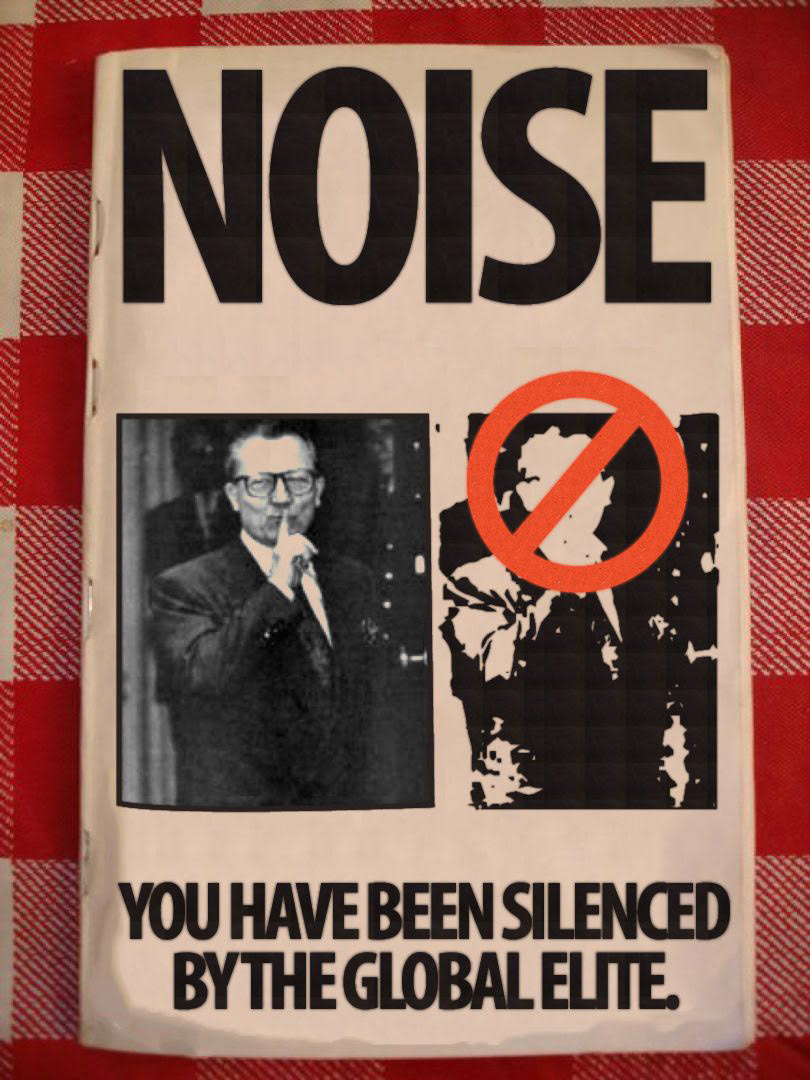
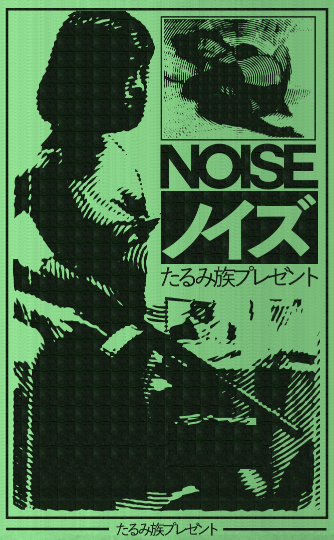
A Zine cover design and custom mockup for "NOISE" mag.
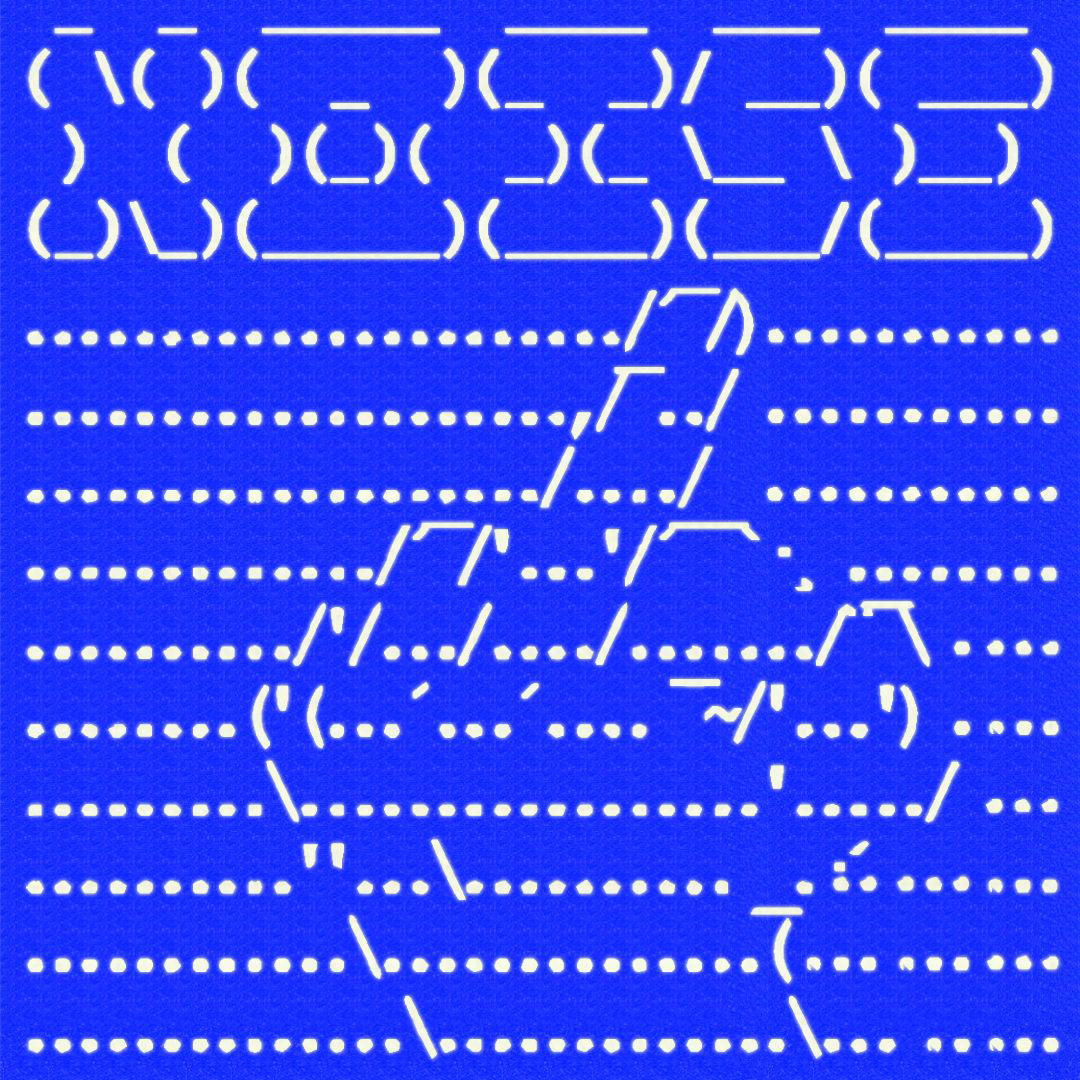
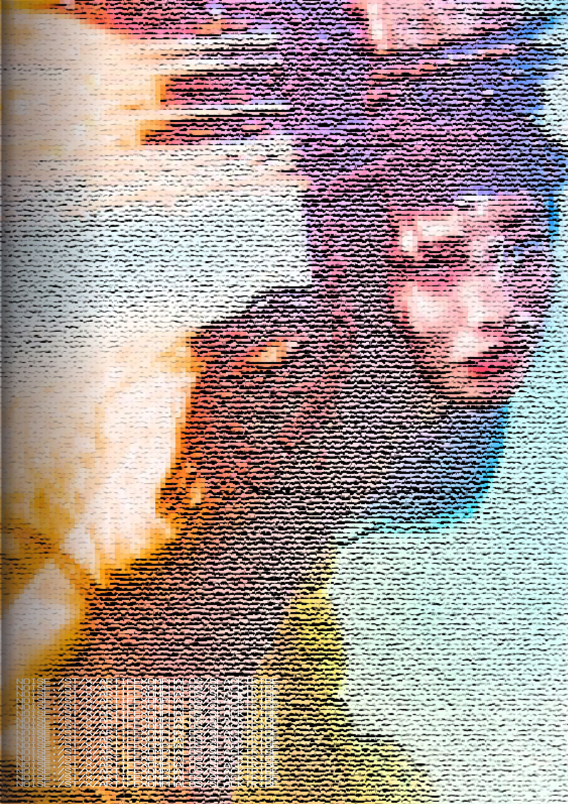
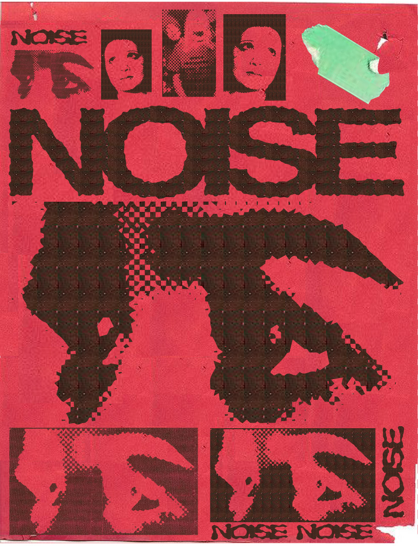
1/2 of a 2 page spread for "NOISE" mag.
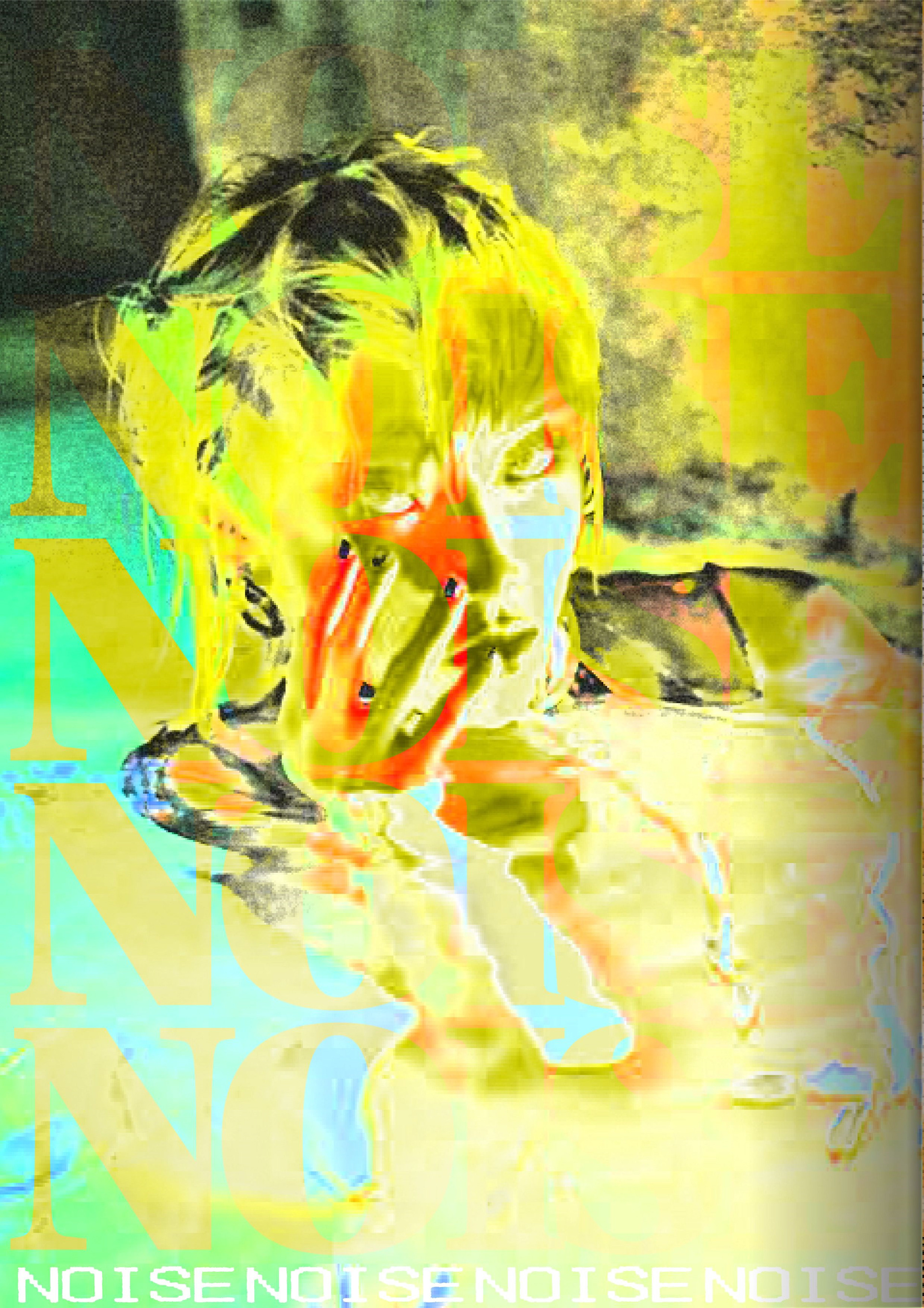
2/2 of the 2 page spread for "NOISE" mag.
An exploration in texture design. This concept flyer was digitally made to look like it was created by a. copy machine.
Half page spread design. An exploration in editing photography to create a desired design effect.
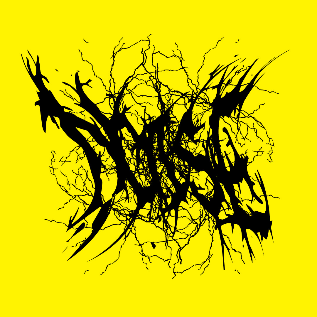
A heavy metal style type design for "NOISE" mag.
An 8-bit heavy metal type design for "NOISE" mag.
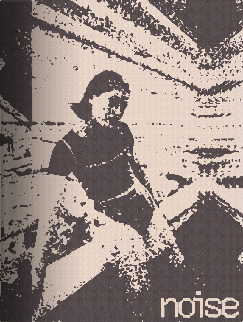
A sticker and/or poster design for "NOISE" mag.
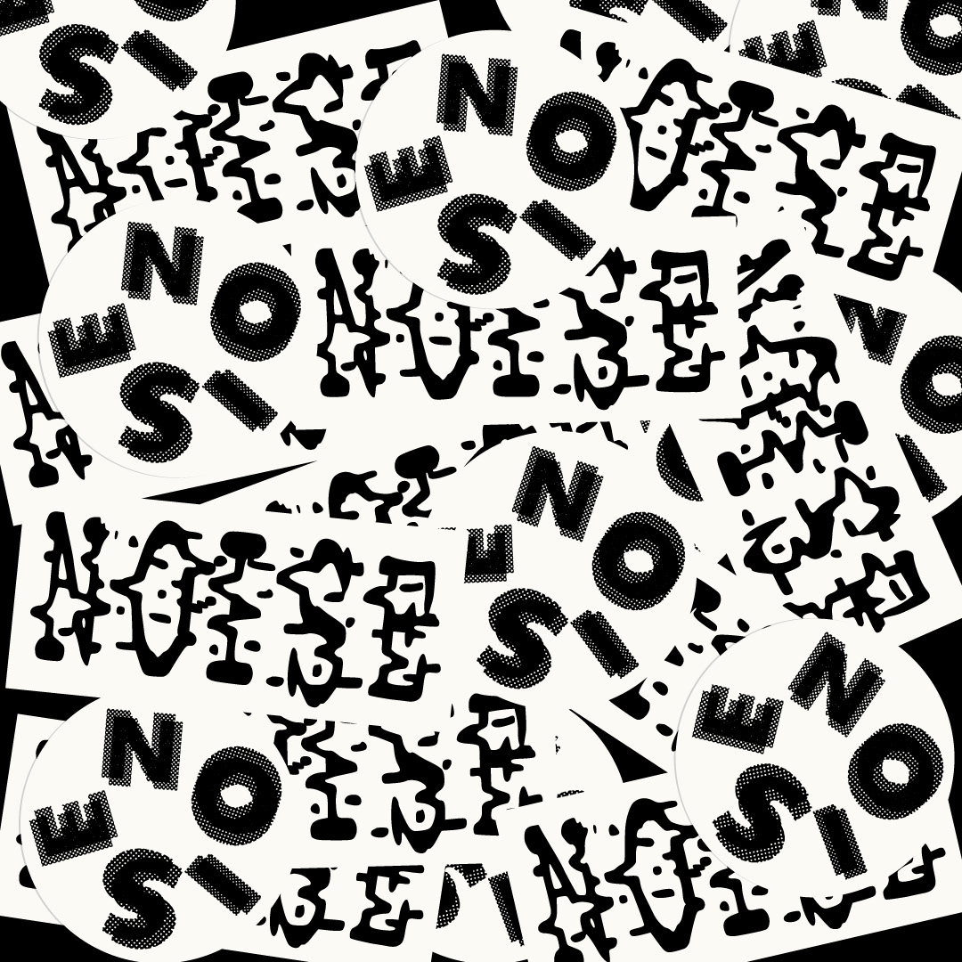
Simple black and white circle and round stickers for "NOISE" mag.
Another exploration in creating the copy machine flyer look digitally.
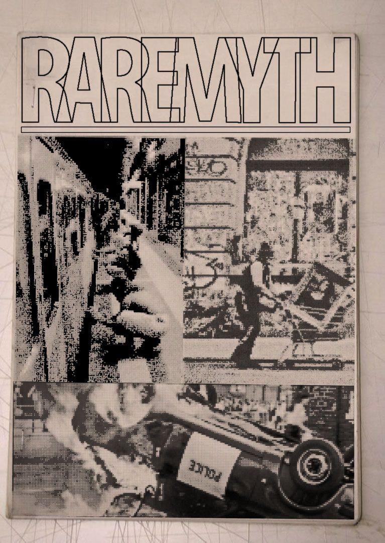
An exploration in mockups, texture and layouts for my brand "RARE MYTH" in a book cover design.
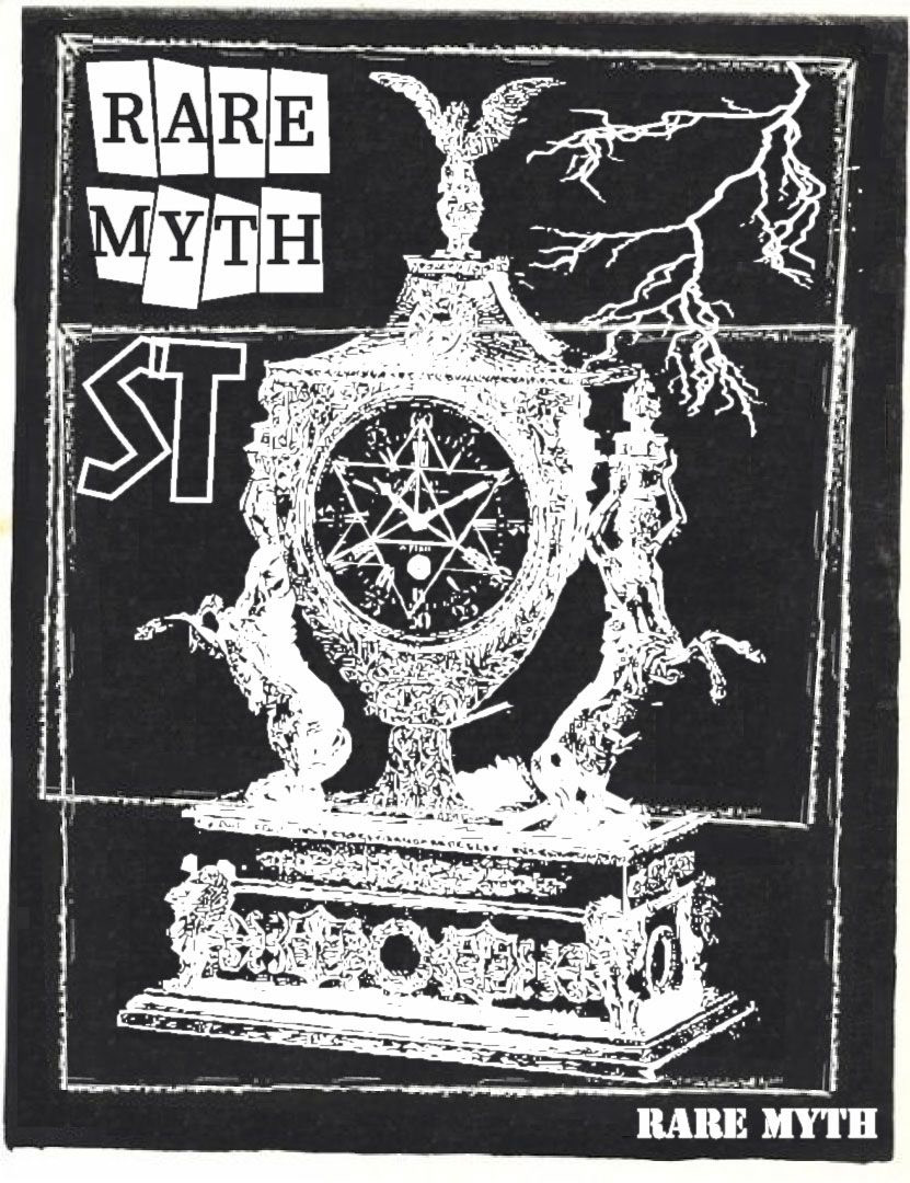
Another exploration in texture, mockup and layout for "RARE MYTH" in a book cover design.
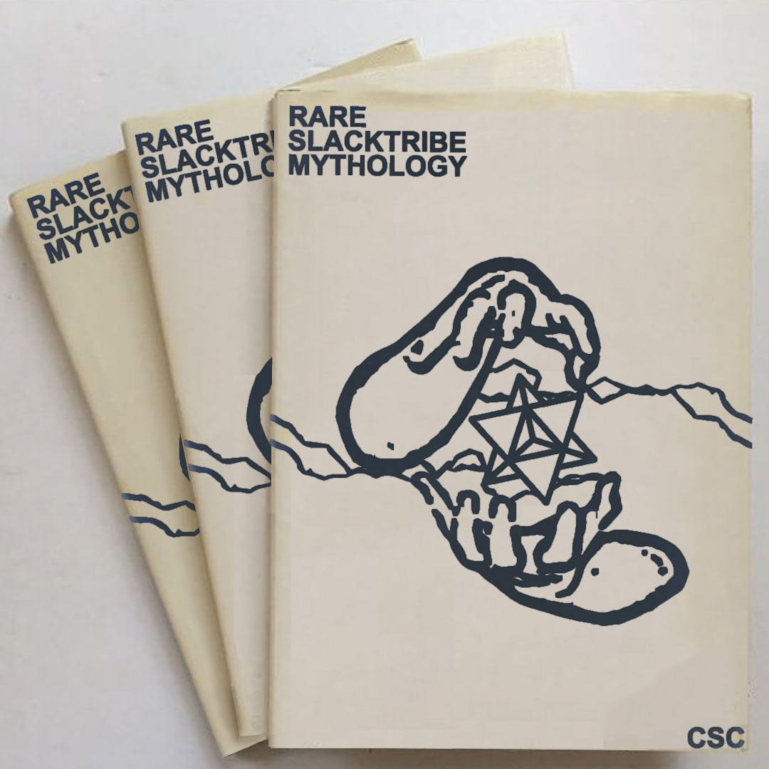
Another exploration in texture, mockup and layout for "RARE MYTH" in a book cover design.
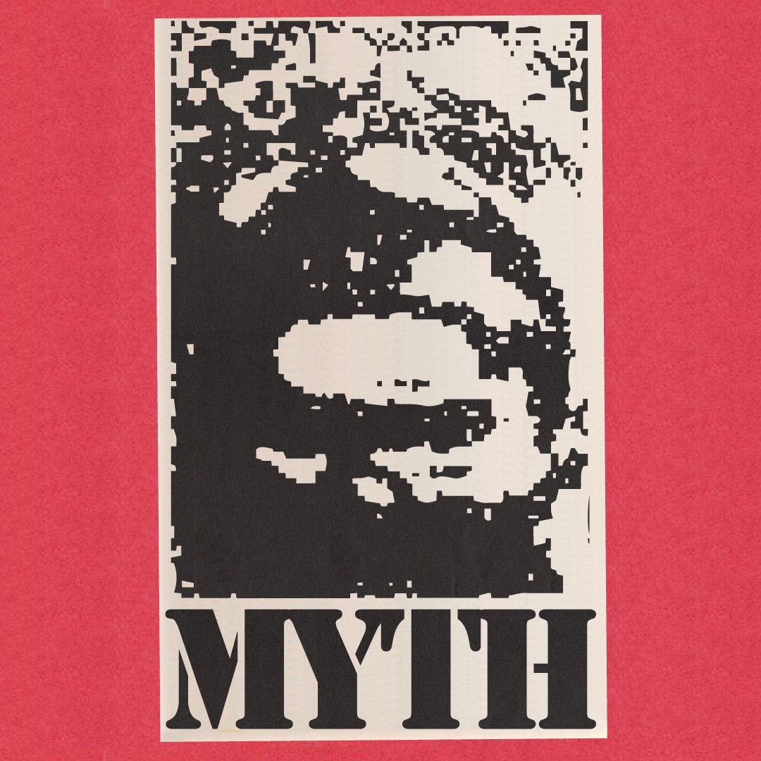
Another exploration in texture, mockup and layout for "RARE MYTH" with a flyer design.
Another exploration in texture, mockup and layout for "RARE MYTH" in an album cover design.
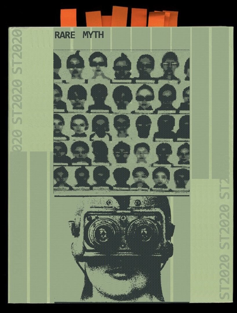
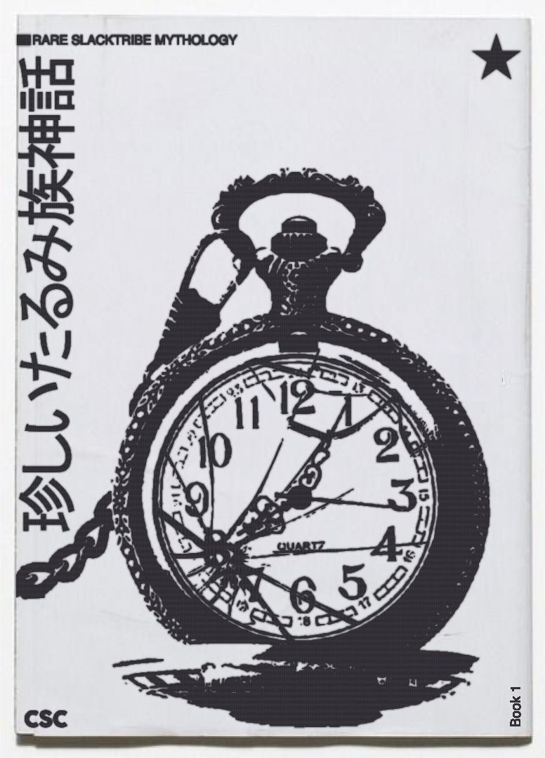
An exploration in mockups, texture and layouts for my brand "RARE MYTH" in a book cover design.
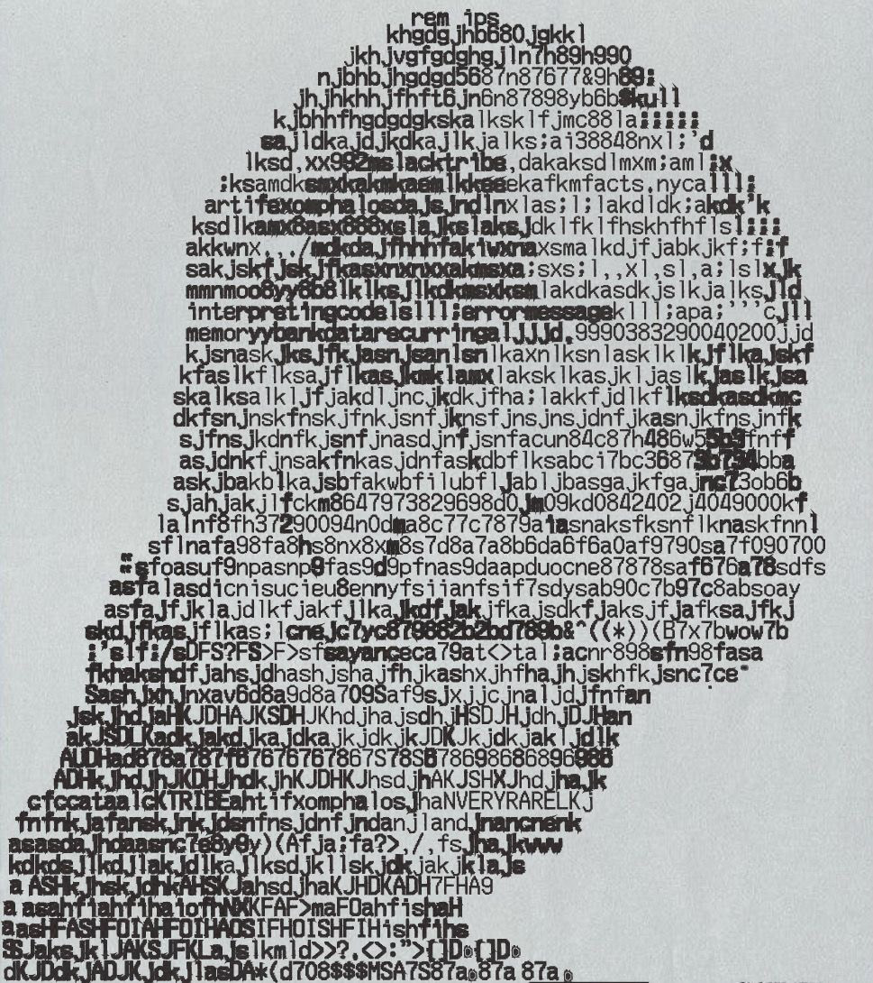
An exploration in using text to create an image. The farther back you look at it the more you should see the image it makes. this was all done manually on illustrator.
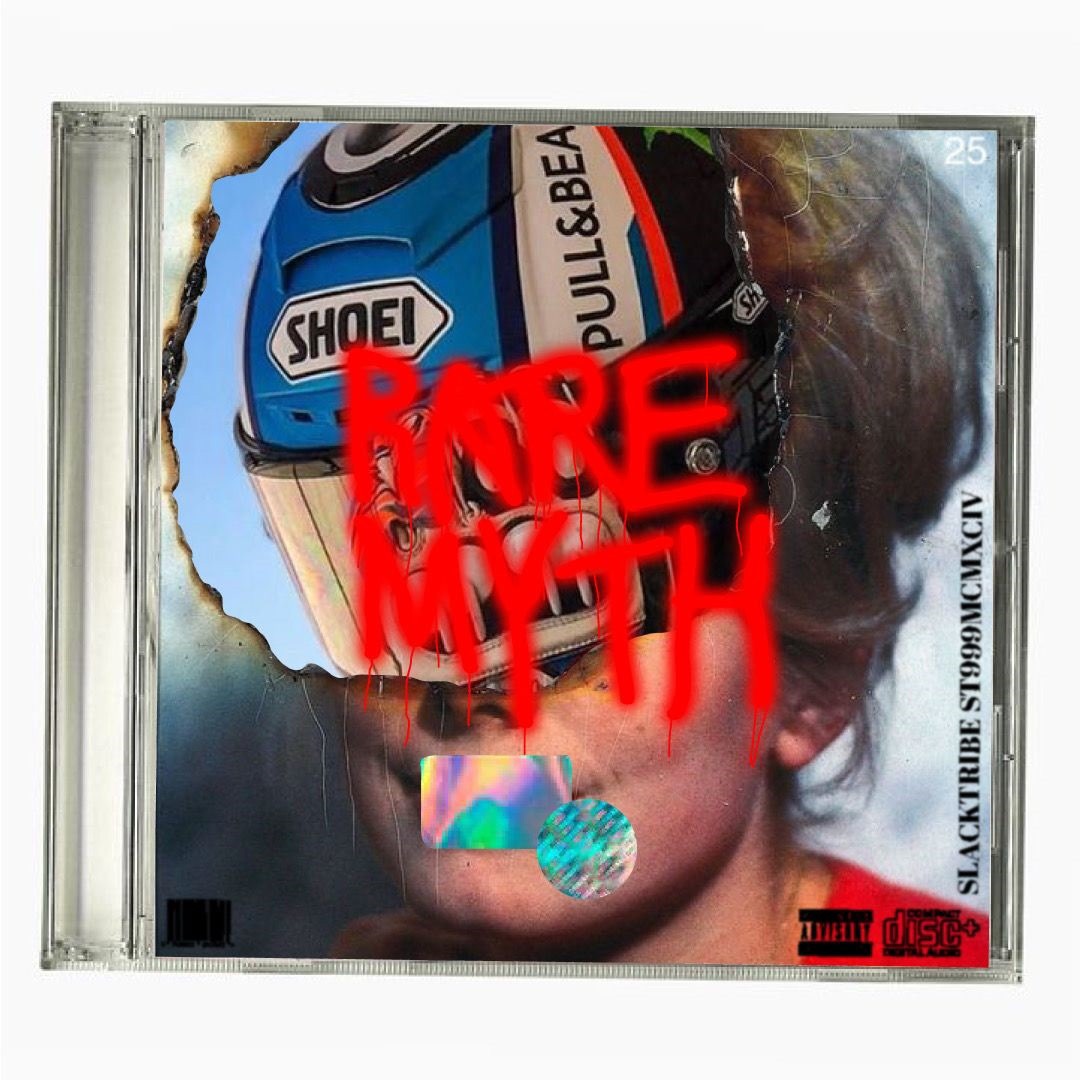
An exploration in mockups, texture and layouts for my brand "RARE MYTH" in an album cover design. The album is currently in progress.
An exploration in mockups, texture and layouts for my brand in a page design.

Another exploration in texture, mockup and layout for "RARE MYTH" with a flyer design.
Another exploration in texture, mockup and layout for "RARE MYTH" with a flyer design.
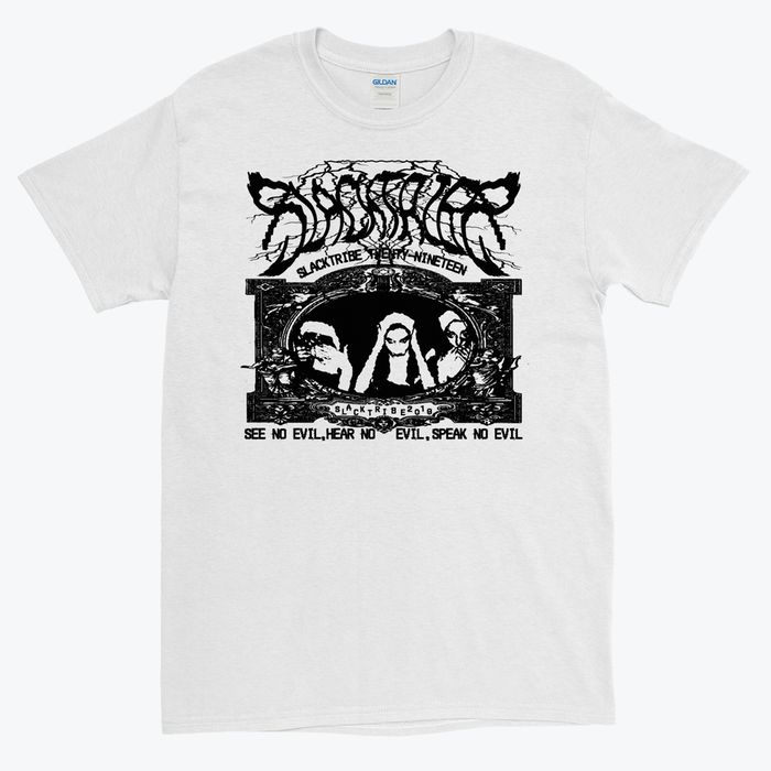
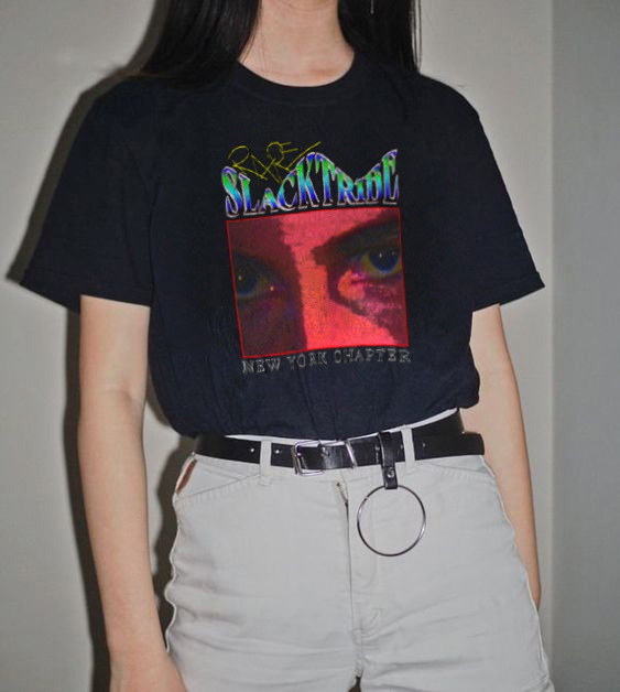
A design for my the first brand I created "SLACKTRIBE" made as an Everpress project. The T-shirt design ended up being featured on their site.
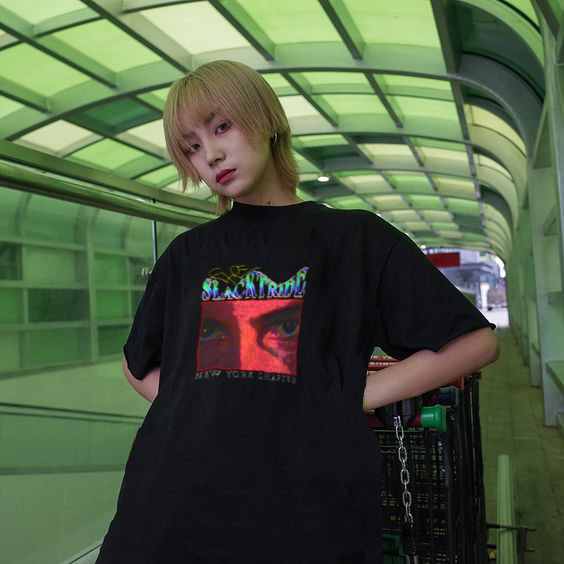
A T-shirt design I created and then decided to explore with creating custom mockups by using Photoshop to place my design on a models T-shirt using warp effects and blend tools.
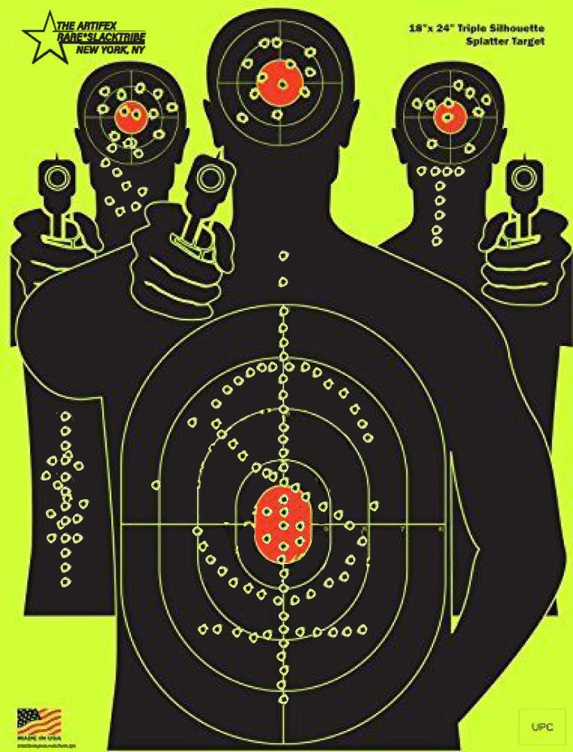
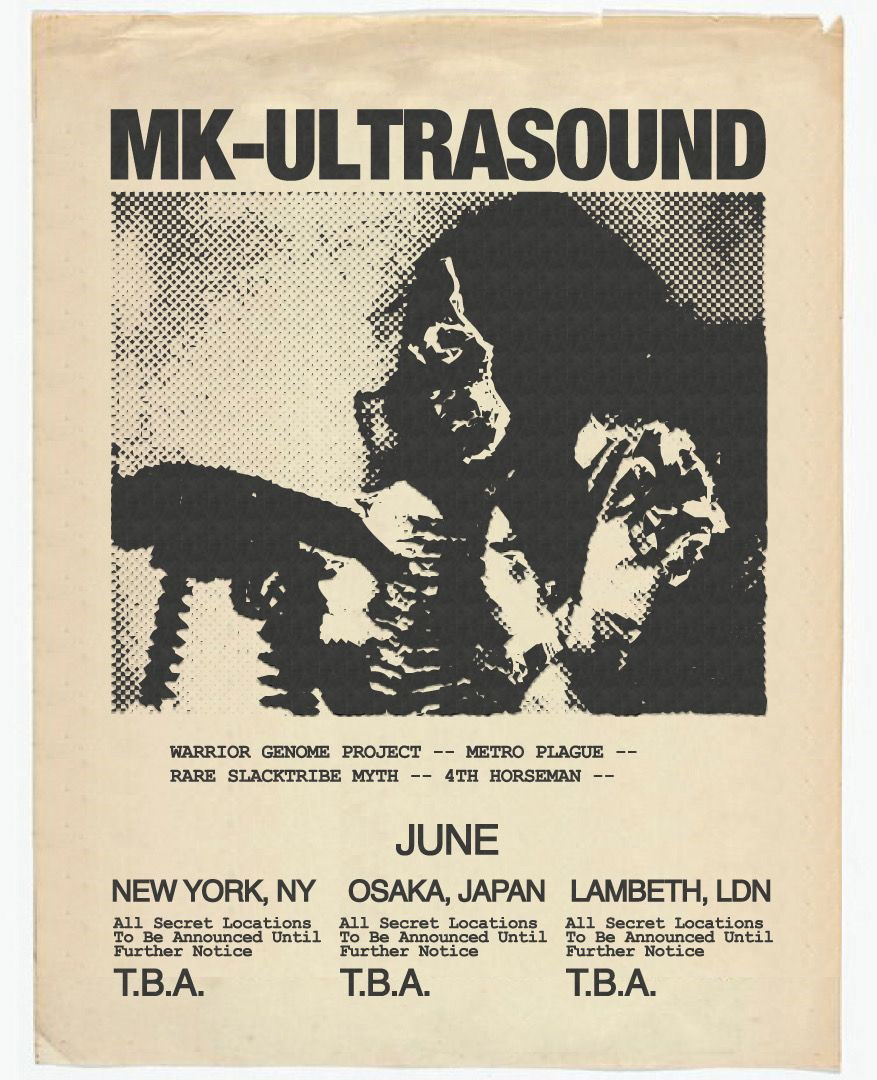
A Flyer concept design for "SLACKTRIBE" I really like the graphical aesthetic of shooting targets so I decided to try and create a poster out of one. This is what came out of the idea.
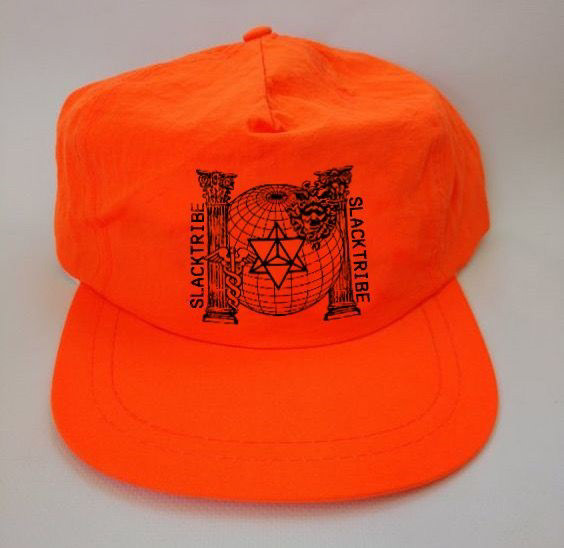
A hat design which I eventually embroidered with my home desktop Brother embroidery machine. This is just a custom mockup made before I tried to make the actual hat.
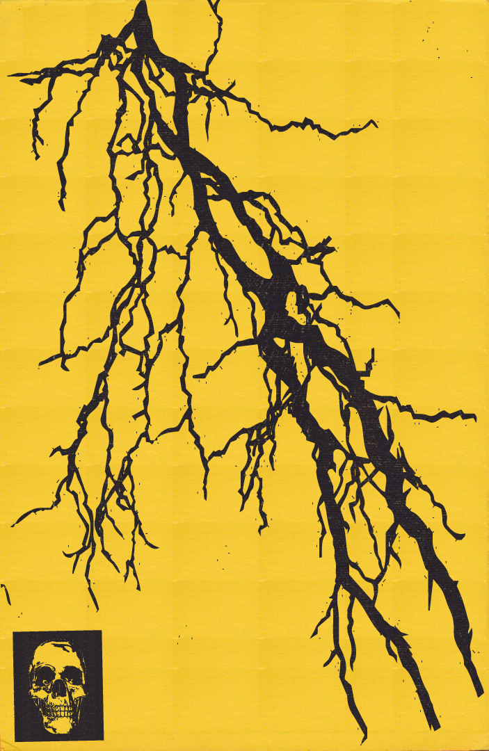
I enjoy making flyer designs like this, the best part is when I get it to look like it was actually printed although it was all digital. I was definitely in a lighting on everything phase.
Another mockup of the same T-shirt design I created. This was also made using warp effects and blend tools on Photoshop.
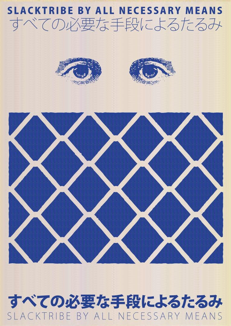
Another Flyer design for "SLACKTRIBE" I think the effect really came through on this one. I specifally like to find the flyer image with tears and missing corners as it really sells what the effect of a physically printed paper.
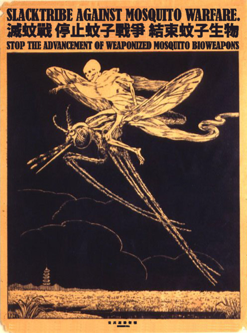
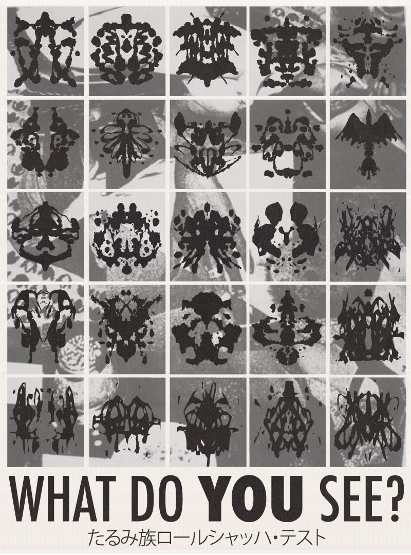
As you may have noticed I really do love foreign characters. I find them beautiful and really hope they translate well. Here is another flyer for "SLACKTRIBE"
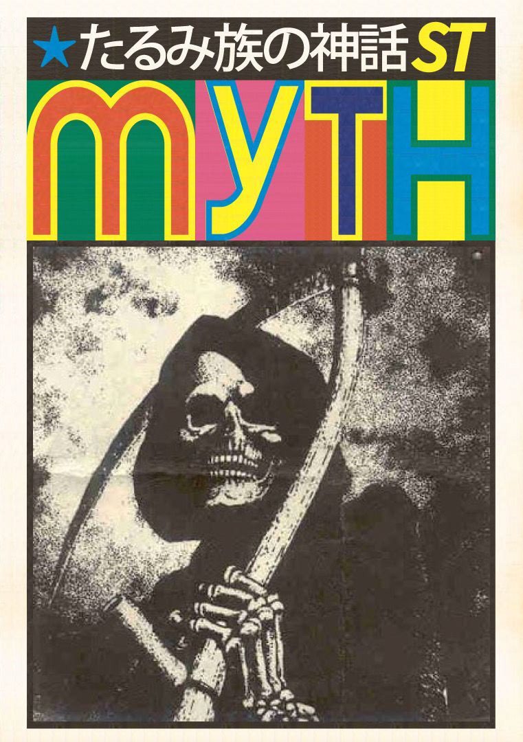
Inspired by an old pamphlet design, must be from around the 70's or 80's maybe. I love how the fold came through from the original mockup reference to really make this look like an old circulated paper pamphlet.
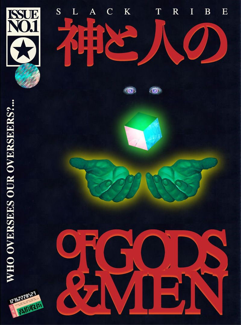
My friends and I are collaborating to create a graphic novel/manga. We have full back stories for characters. This cover was created to be the first issue for our graphic novel "Slack Tribe: Of Gods & Men" I really hope we finish this one day.
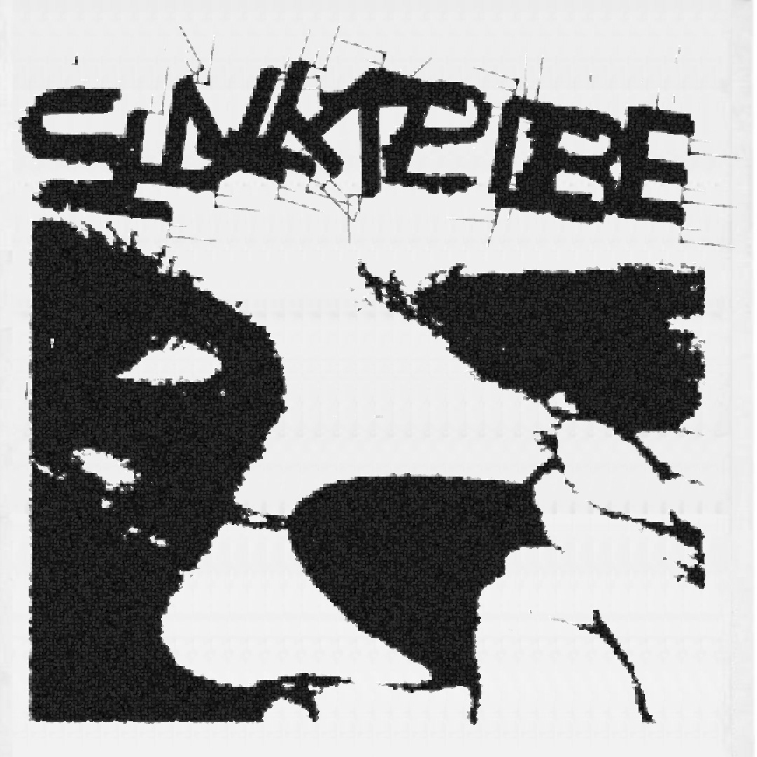
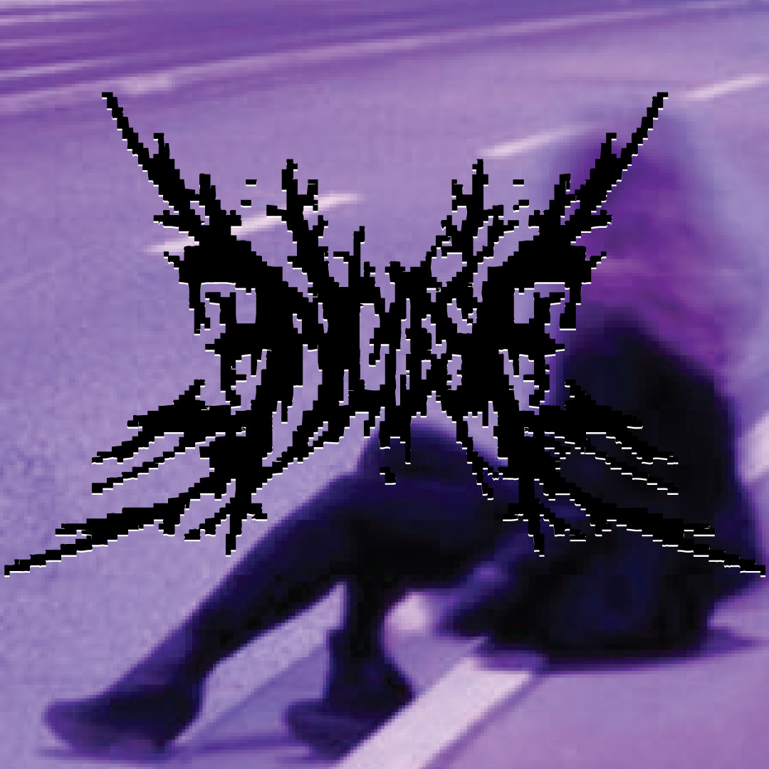
Texture Exploration in the form of a flyer design with punk-y chaotic type design I created by playing with a few letter formations, then cutting, copying and rotating them to loosely spell the word.
Another texture exploration in the form of. a flyer.
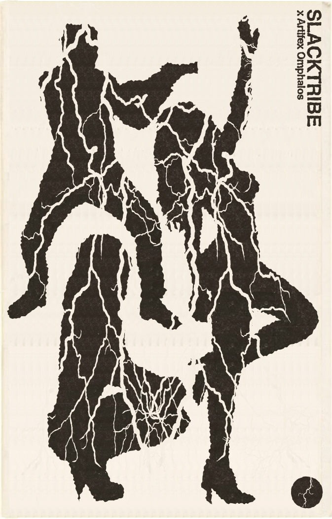
Flyer design exploring more textures and mockup creation. Here I decided to use the lighting patterns over silhouettes to create a more visually dynamic composition.