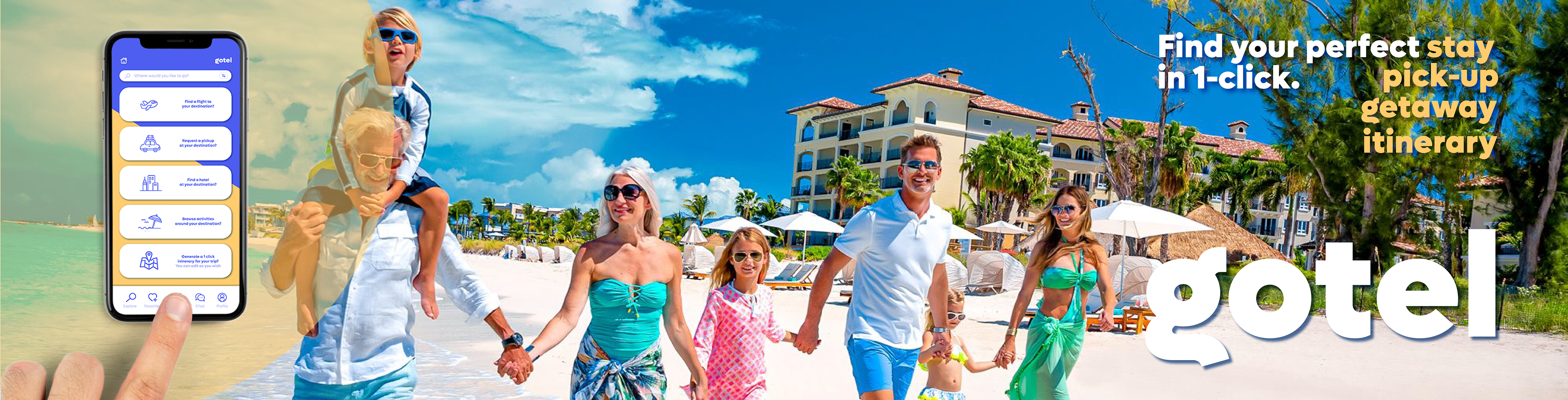
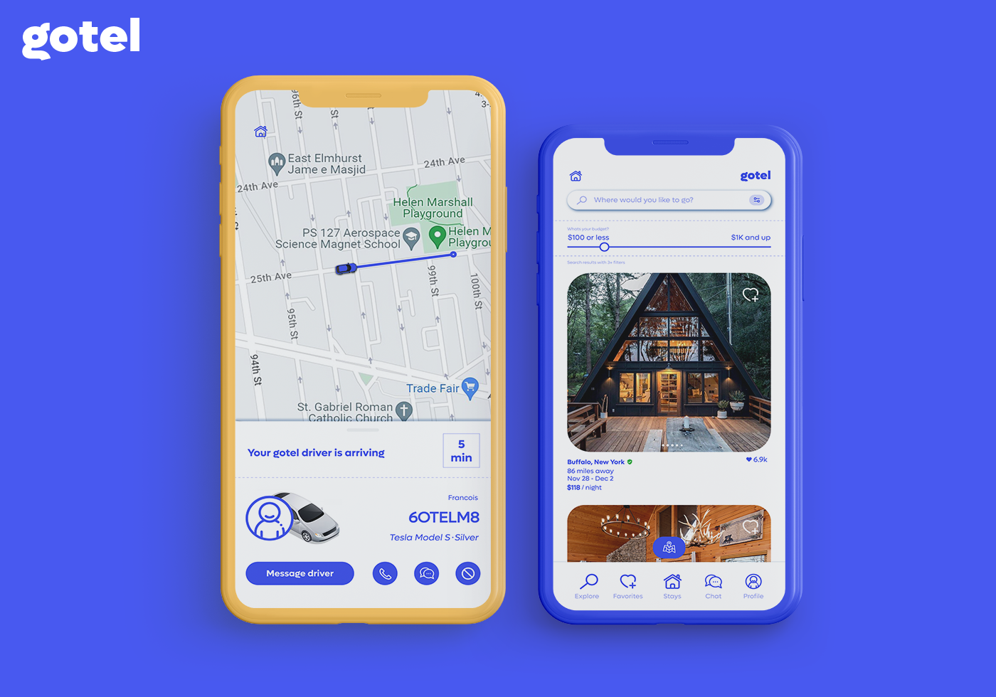
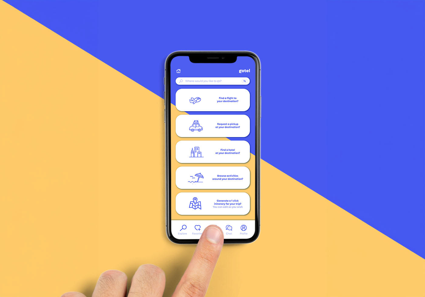
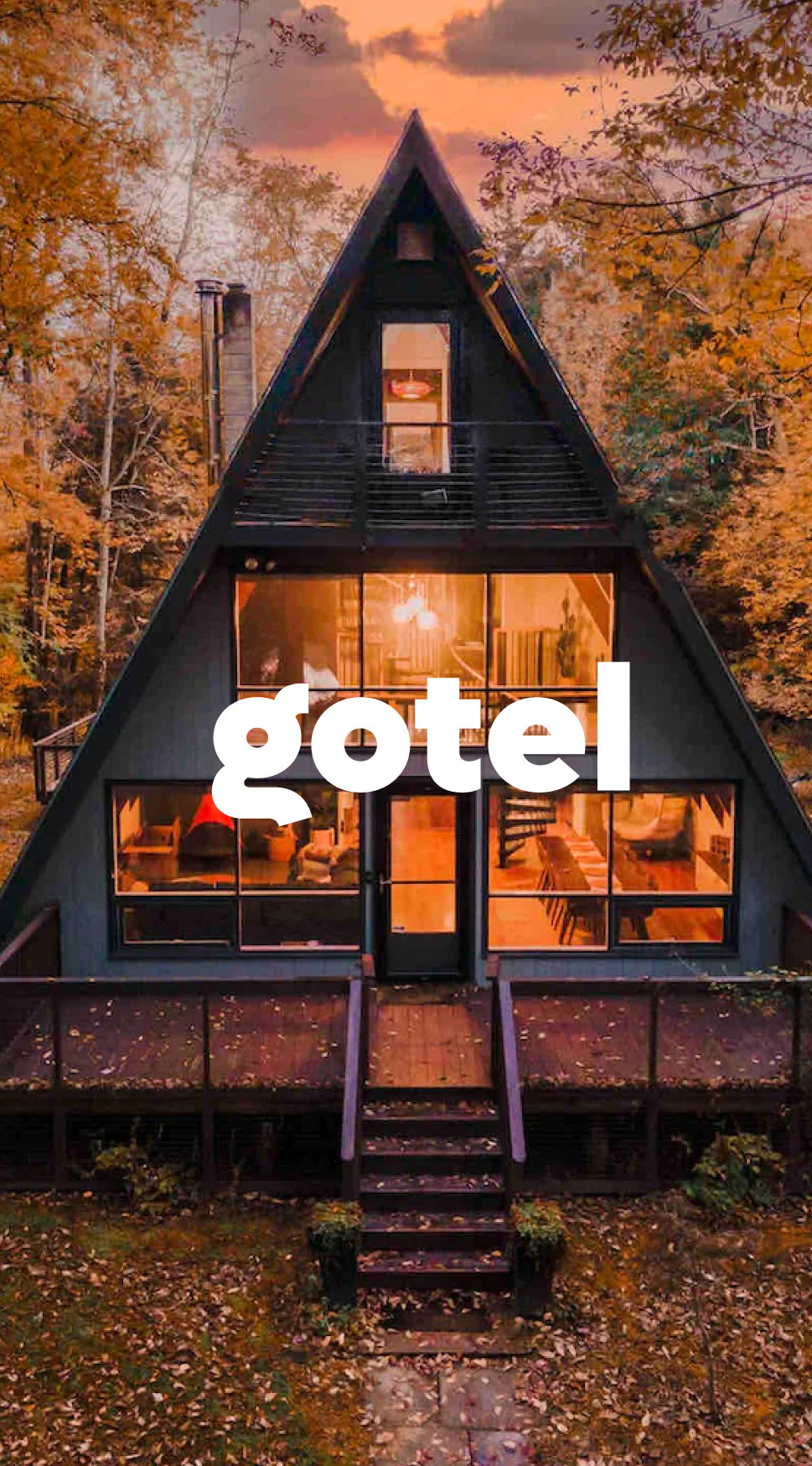
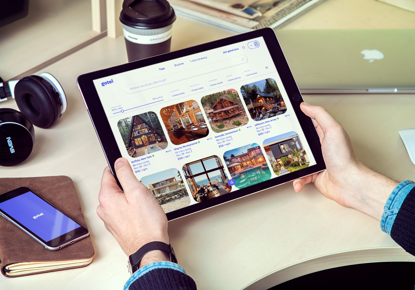
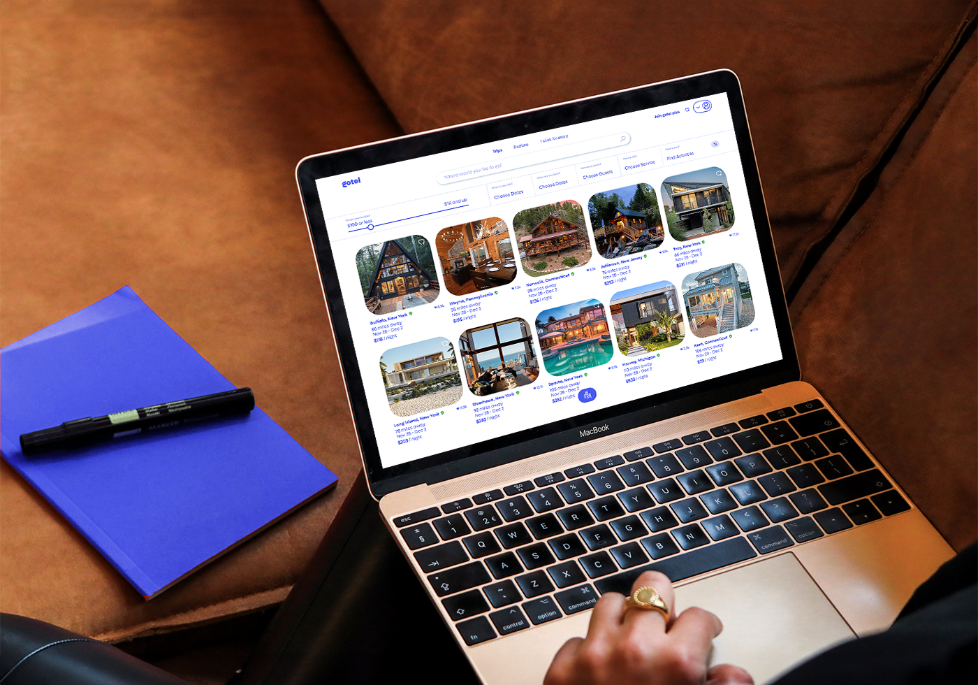
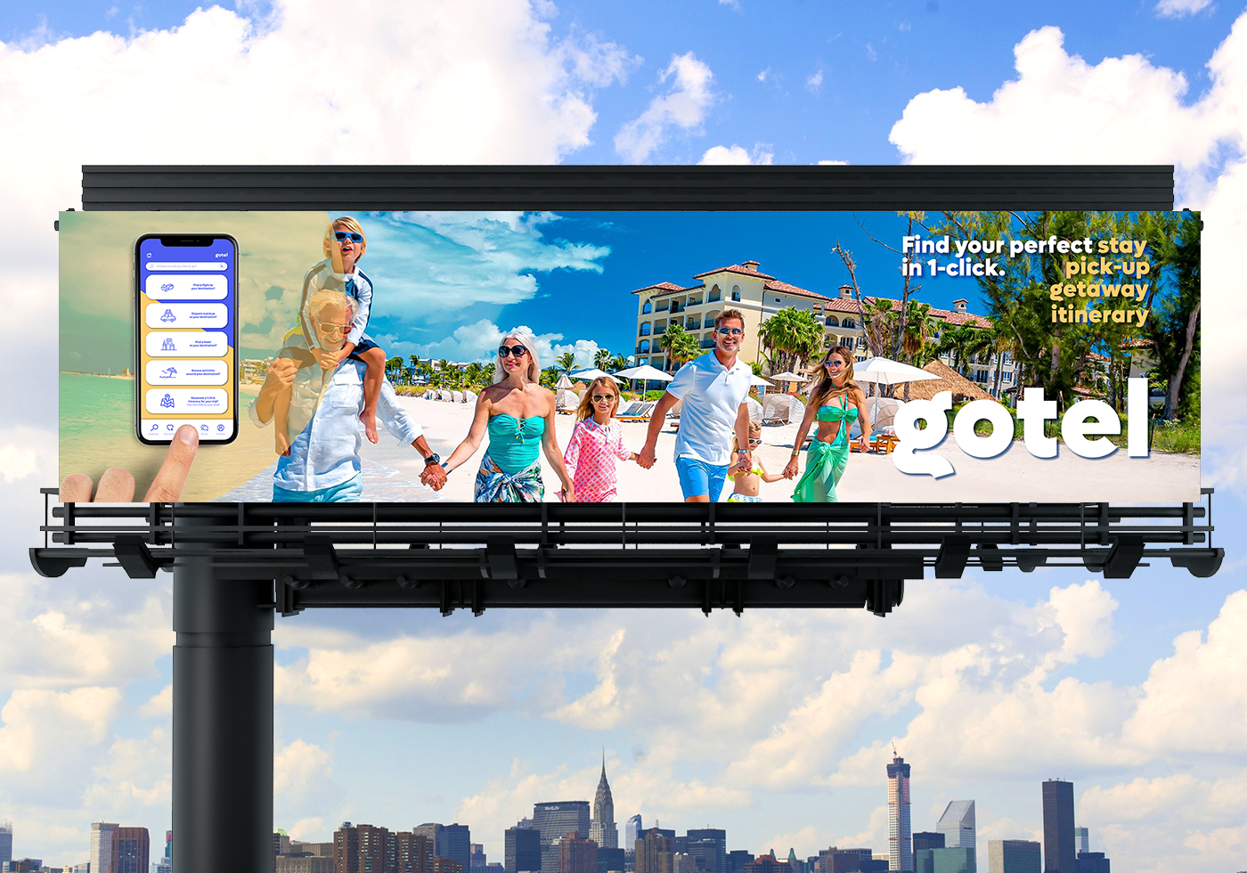
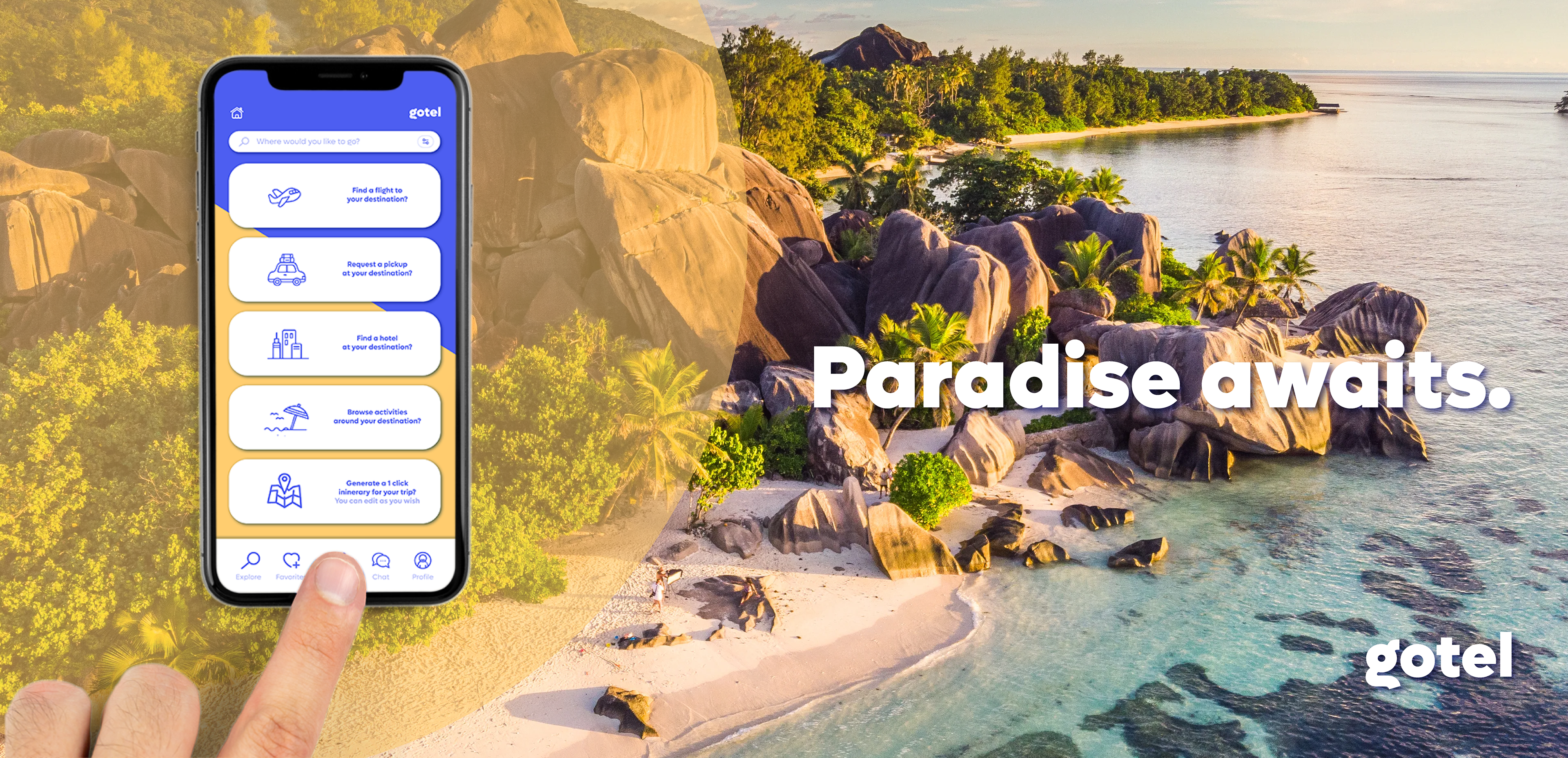
GOTEL is a concept homestay marketplace/trip-booking company that offers an app with a user-friendly layout. The flagship product is the trademarked "1-click itinerary" generator, making it easy for families, couples, friends, or individuals to find activities to do on vacation, business, or road trips. Through the use of filter inputs, the app will generate a comprehensive schedule for you, locate a personal driver and/or rental car, and make recommendations for enjoyable activities, eateries, and places to visit while you're away.

Fully Animated Logo Using Adobe After Effects (Frame Rate lowered for upload)
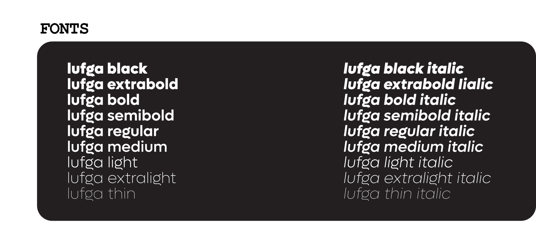
LUFGA FONT FAMILY: WHY?
The "Lufga" font family was chosen for the brand identity for several reasons. Firstly, it was deemed to be great for the main word mark and logo mark due to its unique and eye-catching "g" design. Additionally, it was found to work well for general web and app display text in the other weights of the family, offering consistency and visual harmony throughout the brand's digital presence. Its versatility and adaptability made it the perfect choice for creating a cohesive and visually appealing brand identity across various mediums.
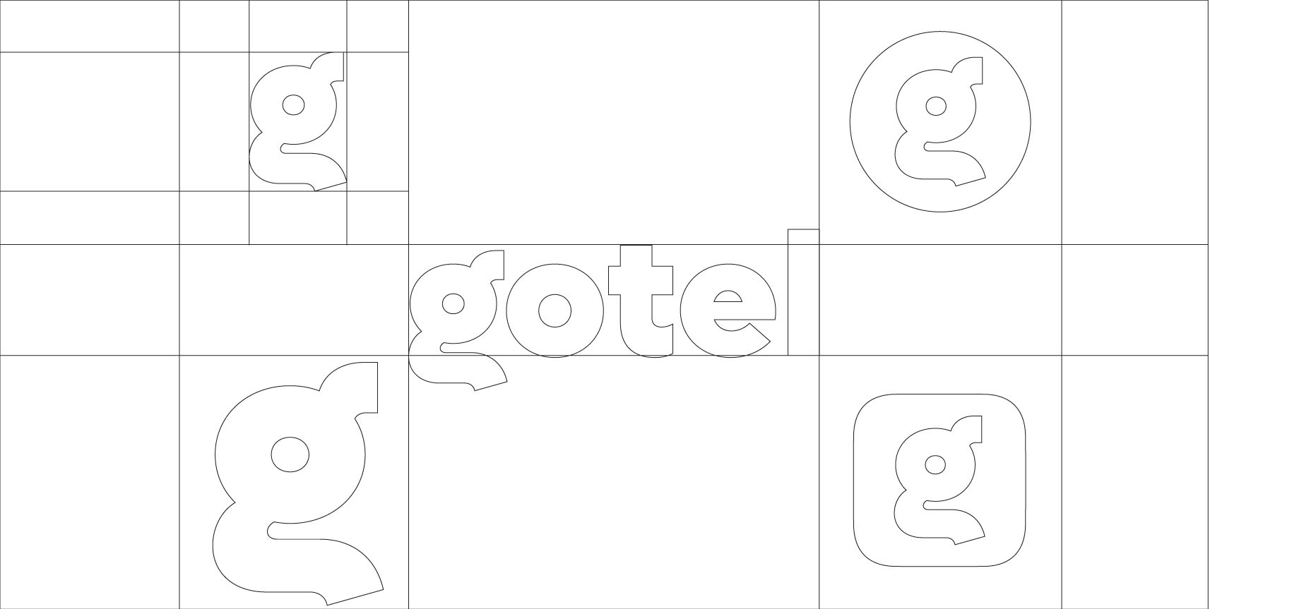
LOGO ICONOGRAPHY: WHY?
The decision to choose the Lufga font for the Gotel logo was driven by its unique design and the scalability potential of its "g" character. The distinctiveness of the "g" allows it to stand out and be used separately from the full wordmark, making it versatile for various applications. For example, the "g" can be placed into a circular shape to represent an Instagram icon or a rounded square for an application icon, providing a consistent visual identity across different platforms and enhancing brand recognition.
COLOR PALETTE: WHY?
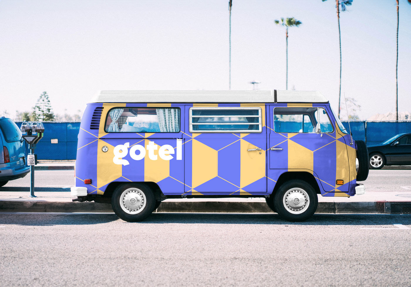
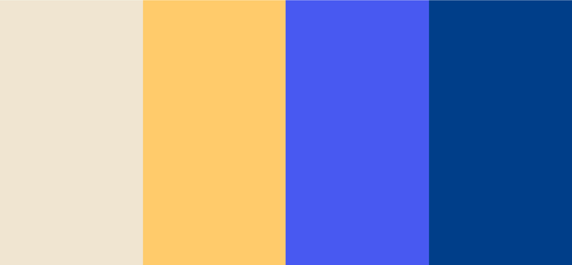
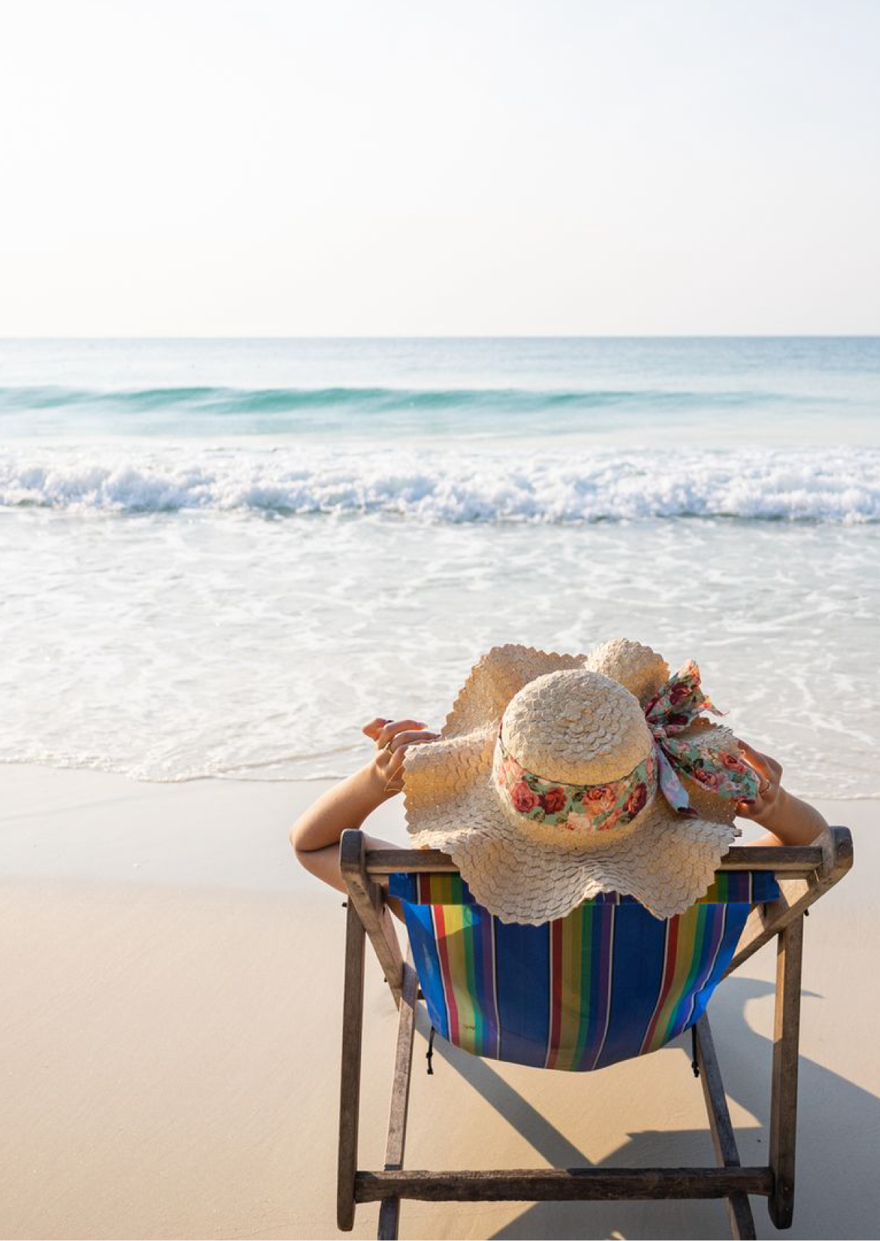
The decision to utilize blues and yellows for the "Gotel" brand identity color palette was influenced by the contrast and symbolic associations of these colors. Blue represents comfort and tranquility, reminiscent of the calmness of the ocean. On the other hand, yellow symbolizes warmth and energy, reminiscent of the sun. This combination evokes a sense of the beach and vacation vibes, making it fitting for a travel-based app. The color palette creates a harmonious theme that resonates with users, inviting them to explore and experience the relaxation and joy of a beach getaway.
App interface UI/UX Design
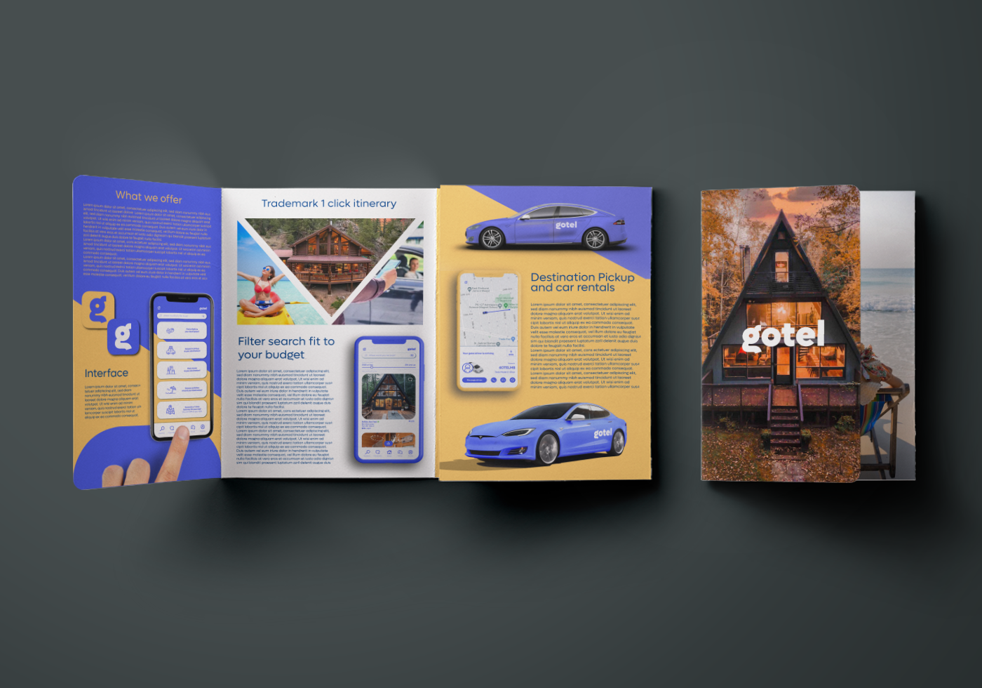
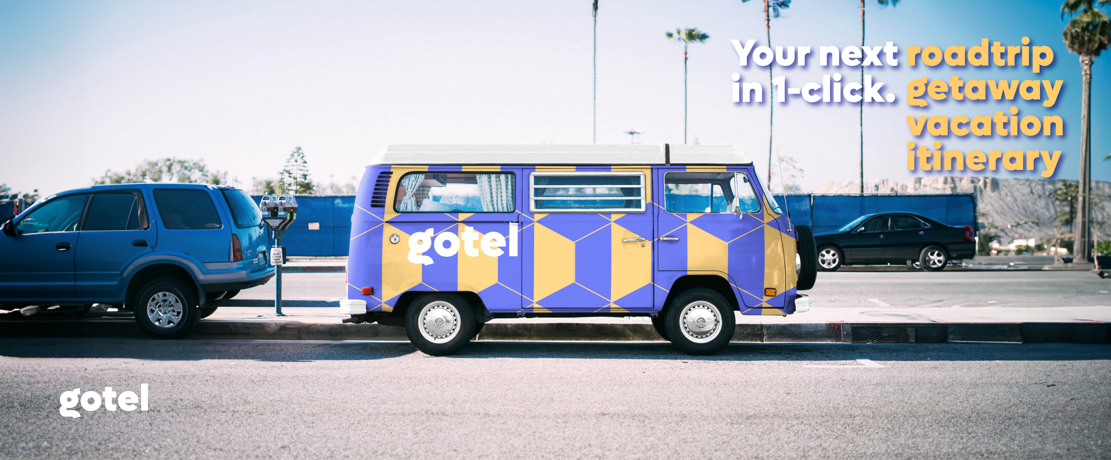
Print, layout and brochure design
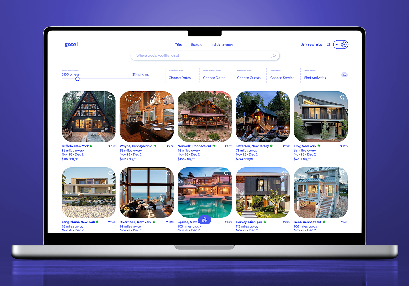
Web design with tablet compatibility
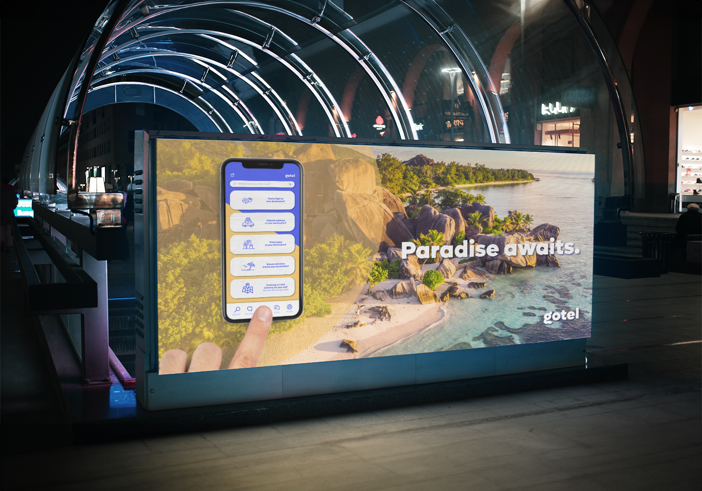
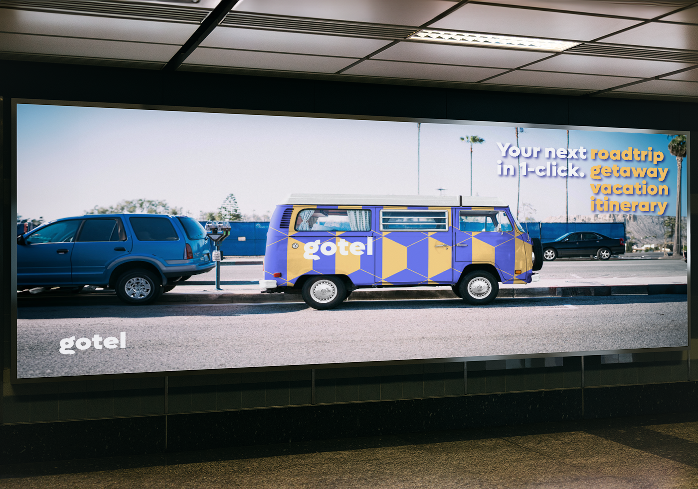
Billboard Ads
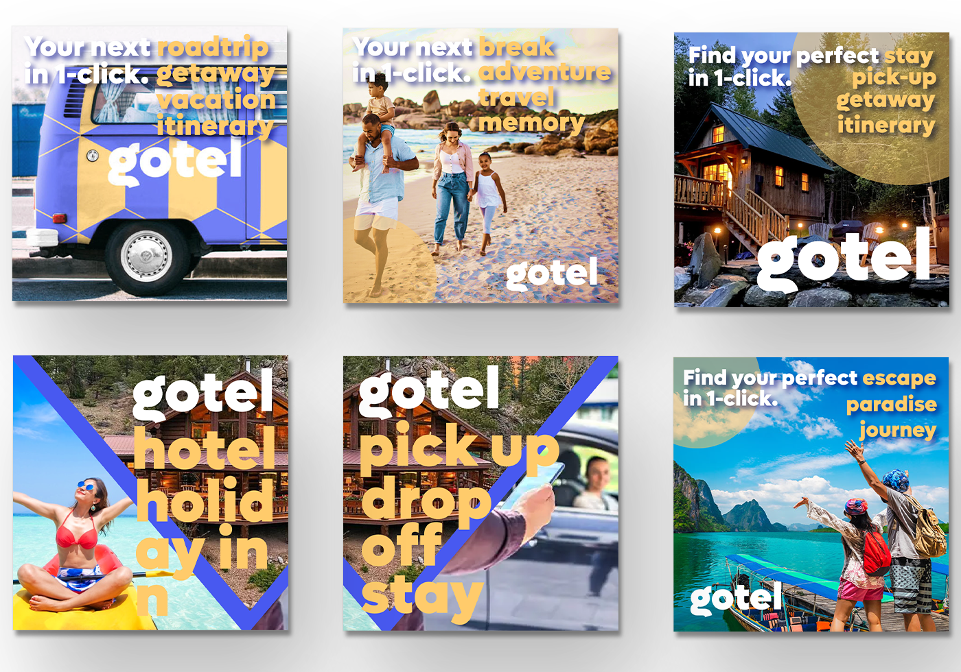
Social Media Ads