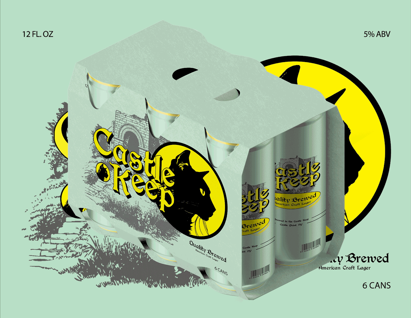
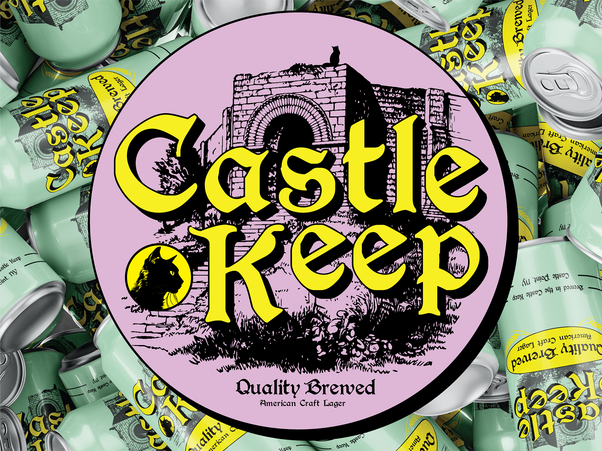
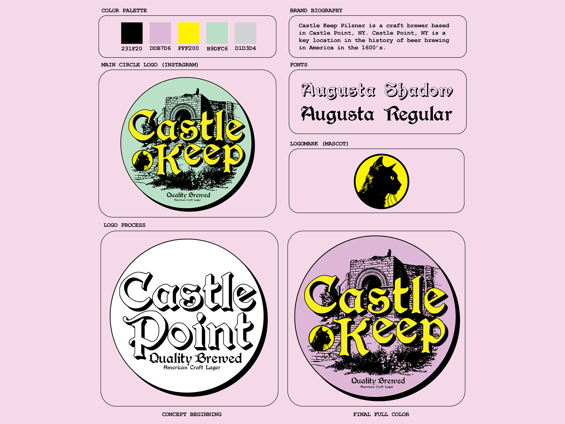
Castle Keep Lager is a concept American craft brewery based in Castle Point, NY. Castle Point, NY is a key location in the history of beer brewing in America dating back to the 1600's.
CHOOSING TYPE: WHY?
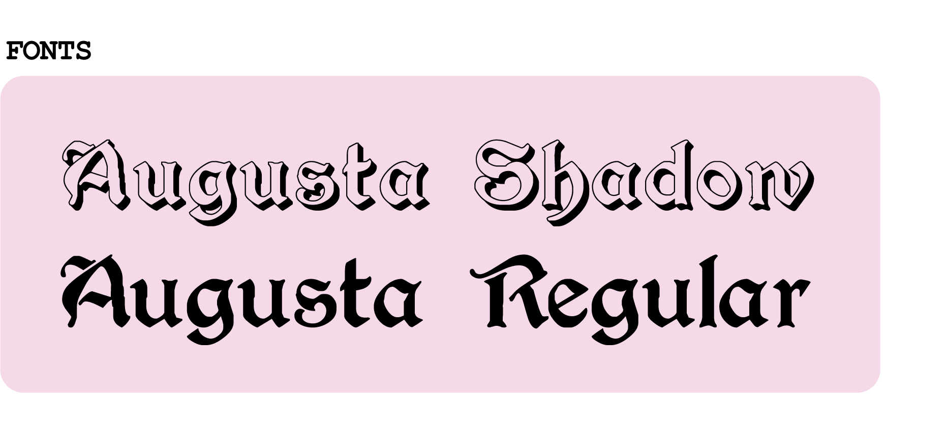
The Augusta Font was chosen for the main logotype, reflecting Castle Keep's rich heritage and connection to Castle Point, NY. Gothic or blackletter typefaces further provide a medieval vibe that complements the Castle Keep's branding. The Gothic/Blackletter font was used to maintain the castle-like aesthetic and align with the brand's tagline "Treat Yourself Like a King, Drink a Castle Keep".

COLOR PALETTE: WHY?
The thought process behind the color palette was to give the brand a contemporary appearance and make the drink stand out on shelves as an eye-catching beverage. Vibrant hues also suggest flavors that pop, like those found in desserts and sweets. The mouth watering pastel color scheme was aimed to capture the attention from drinkers and drink enthusiasts searching for something new to bring to the party. The light, fresh, and vibrant color scheme also reflects CASTLE KEEP'S flagship beverage flavor lineup.
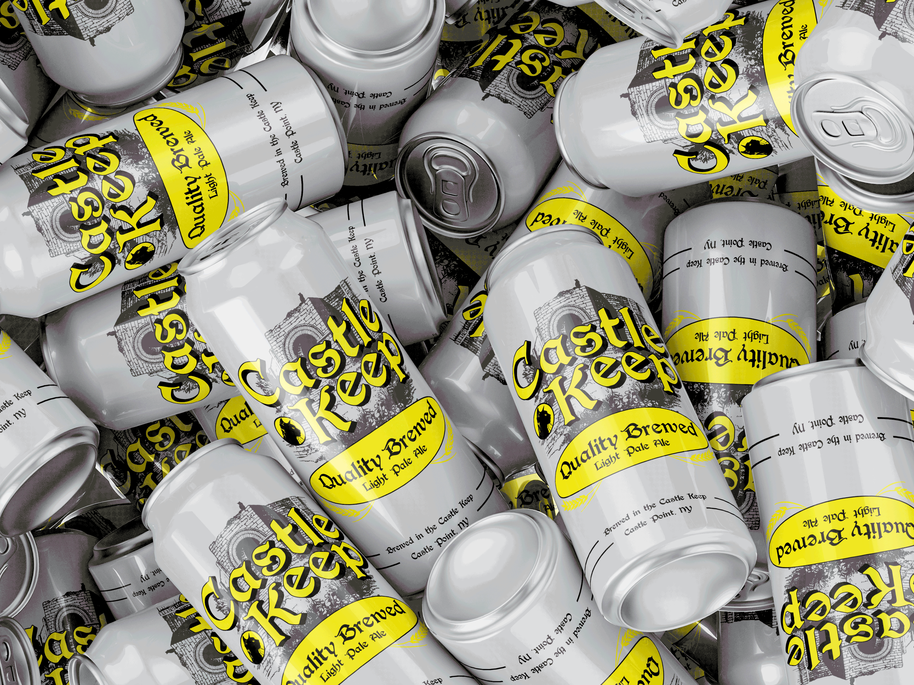
Animated Can Mockup with Flavors
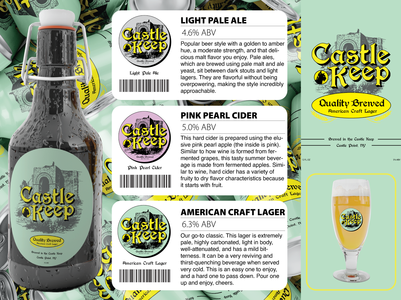
Beer sales sheet
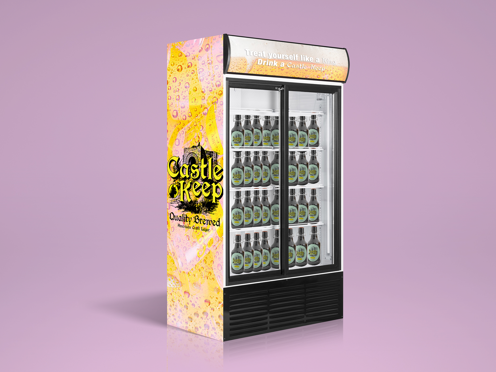
In-store promotional drink cooler
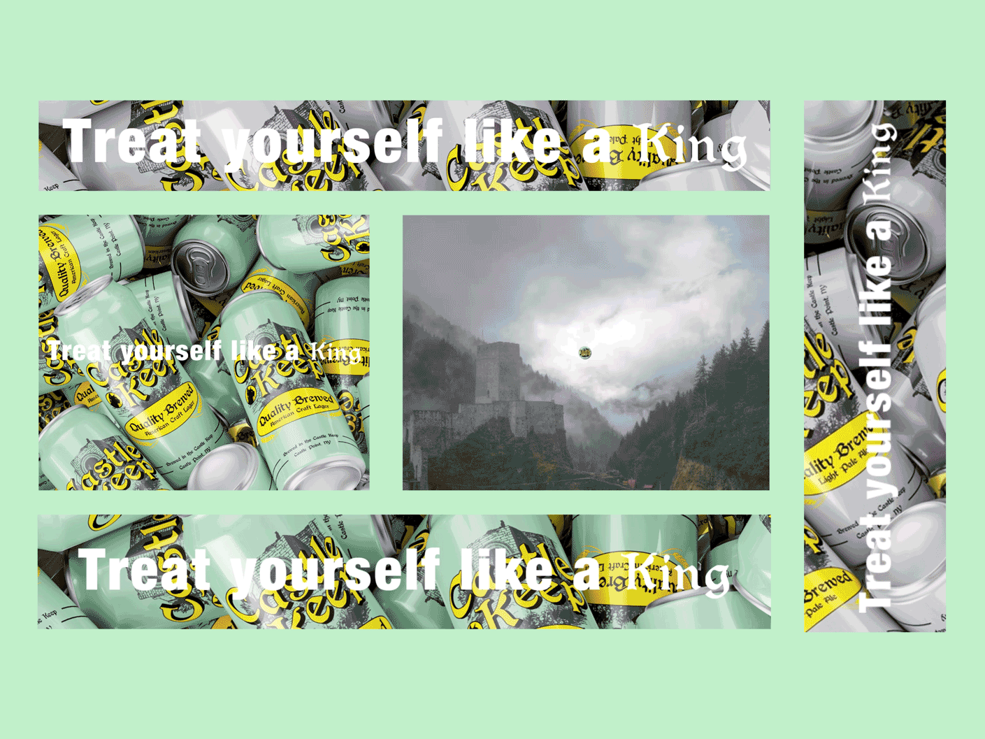
Animated banner ads for web and mobile
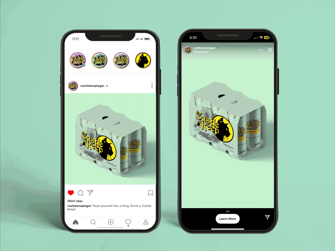
Animated ads for Instagram/ social media